Data Visualization with pandas
Data visualization is a crucial part of data analysis, allowing you to explore, understand, and communicate your data's insights effectively. Pandas provides built-in plotting capabilities that enable you to quickly create basic visualizations without needing additional libraries.
1. Basic Plotting with pandas
Pandas makes it easy to create a variety of standard visualizations directly from your DataFrame.
1.1 Line Plots
Line plots are useful for visualizing data over time or continuous data. You can create a line plot using the .plot() method.
import pandas as pd

# Sample data
data = {
    'Year': [2020, 2021, 2022, 2023, 2024],
    'Sales': [200, 220, 240, 260, 280]
}
df = pd.DataFrame(data)

# Creating a line plot
df.plot(x='Year', y='Sales', kind='line', title='Yearly Sales')
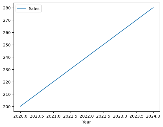
Figure 1: Line Plot showing yearly sales.
1.2 Bar Plots
Bar plots are ideal for comparing categorical data. You can create a bar plot by specifying kind='bar' in the .plot() method.
# Creating a bar plot
df.plot(x='Year', y='Sales', kind='bar')
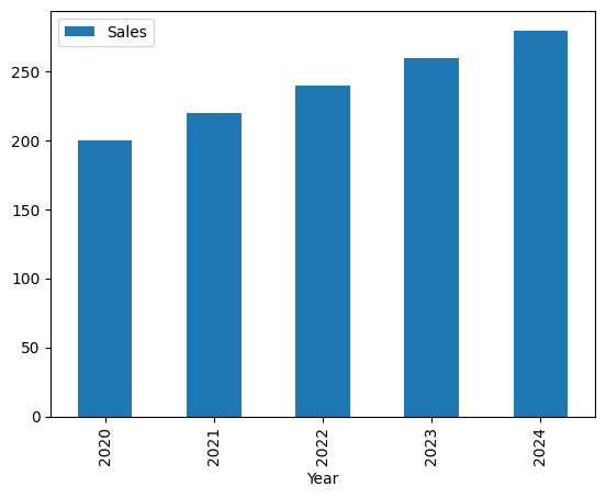
Figure 2: Bar Plot comparing yearly sales.
1.3 Histogram
Histograms are used to visualize the distribution of a dataset. Pandas makes it easy to create a histogram with the .plot() method.
# Creating a histogram
df['Sales'].plot(kind='hist')
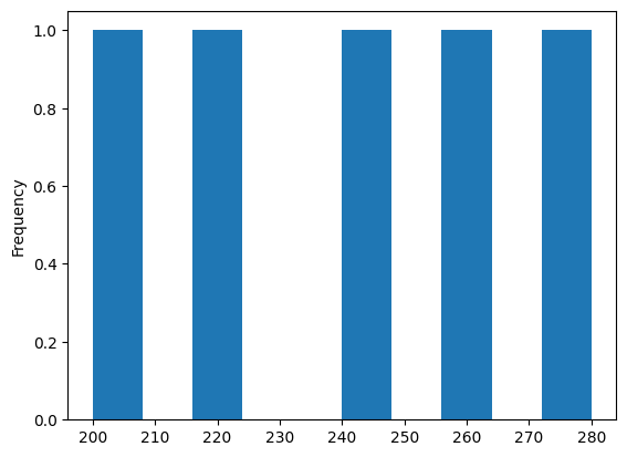
Figure 3: Histogram showing the distribution of sales.
1.4 Scatter Plots
Scatter plots are useful for identifying relationships between two numerical variables.
# Sample data with two variables
data = {
    'Advertising': [50, 60, 70, 80, 90],
    'Sales': [200, 220, 240, 260, 280]
}
df = pd.DataFrame(data)

# Creating a scatter plot
df.plot(x='Advertising', y='Sales', kind='scatter')
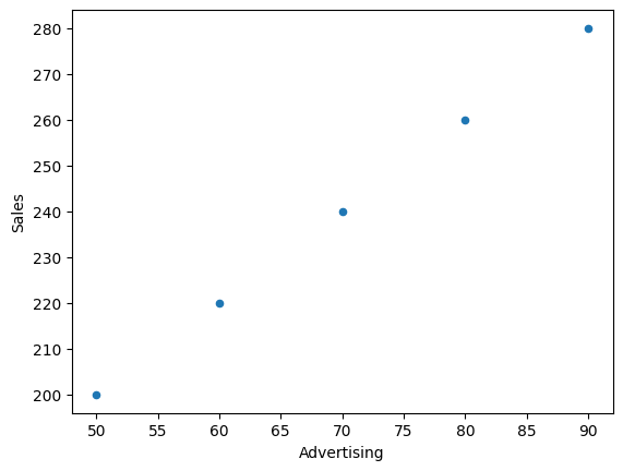
Figure 4: Scatter Plot showing the relationship between advertising spend and sales.
1.5 Box Plots
Box plots (or whisker plots) provide a summary of a dataset’s distribution, including its median, quartiles, and outliers.
# Sample data with multiple categories
data = {
    'Category': ['A', 'A', 'A', 'B', 'B', 'B'],
    'Values': [100, 120, 110, 150, 160, 155]
}
df = pd.DataFrame(data)

# Creating a box plot
df.boxplot(by='Category', column='Values', grid=False)
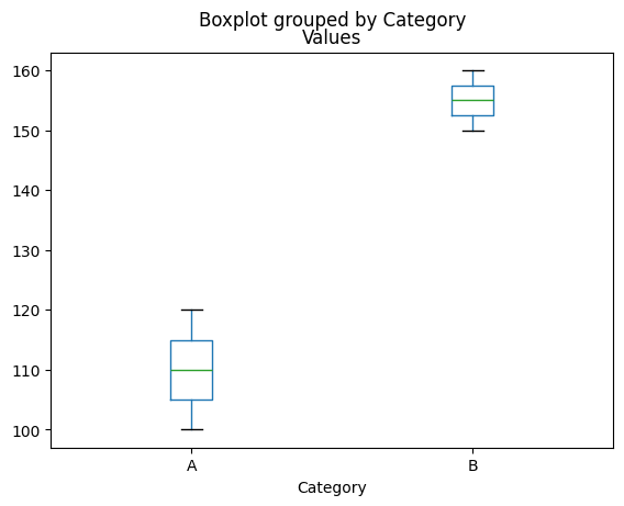
Figure 5: Box Plot comparing values across different categories.
2. Customizing Your Plots
Pandas allows you to customize your plots with various options to enhance their appearance and make them more informative.
2.1 Adding Titles and Labels
You can add titles and labels to your plots to provide more context.
# Adding a title and labels to a line plot
df.plot(x='Year', y='Sales', kind='line', title='Yearly Sales')
plt.xlabel('Year')
plt.ylabel('Sales')
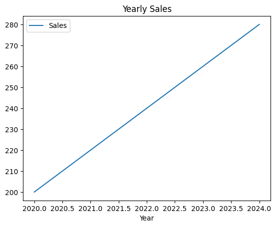
Figure 6: Custom Line Plot with title labels.
2.2 Changing Plot Styles
Pandas supports different styles for your plots, which you can set using the style parameter.
# Changing the style of a line plot
df.plot(x='Year', y='Sales', kind='line', style='--', title='Yearly Sales')
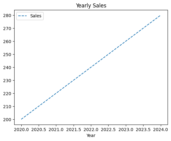
Figure 7: Styled Line Plot with dashed lines.
3. Saving Plots to Files
Once you’ve created a plot, you might want to save it to a file for later use or reporting.
3.1 Saving Plots
You can save a plot directly using the savefig() method from Matplotlib, which pandas uses under the hood for plotting.
# Saving a plot to a file
df.plot(x='Year', y='Sales', kind='line', title='Yearly Sales')
plt.savefig('yearly_sales.png')
4. Conclusion
Pandas’ built-in plotting capabilities make it easy to create basic visualizations directly from your DataFrame. These simple yet powerful tools are often sufficient for exploring your data and conveying your findings. Advanced visualization techniques can be explored later using libraries like Matplotlib and Seaborn.