Interpreting and Visualizing Evaluation Metrics
Understanding how to interpret and visualize evaluation metrics is critical for gaining deeper insights into model performance. Visualization helps to contextualize metrics, making it easier to communicate findings and make informed decisions. This article explores key strategies for interpreting evaluation metrics and provides techniques for visualizing them effectively.
In this article, we will use some supervised machine learning algorithms. In the next section, "Supervised Machie Leanring" you will learn about these algorithms in-depth. For now, it’s not necessary to fully understand the algorithms; the focus is on interpreting the results.
1. Importance of Interpreting Evaluation Metrics
1.1 Beyond the Numbers
Evaluation metrics provide quantitative measures of model performance, but understanding what these numbers mean in practice is essential. Misinterpretation of metrics can lead to incorrect conclusions about a model’s effectiveness.
1.2 Context Matters
The context in which a metric is used can significantly impact its interpretation. For example, a high accuracy might not be meaningful in an imbalanced dataset, where precision, recall, or F1-score would provide better insights.
2. Key Concepts in Interpretation
2.1 Thresholds and Trade-offs
Many metrics depend on thresholds, such as those used in classification tasks. Adjusting the threshold can impact metrics like precision, recall, and F1-score, leading to different trade-offs.
Example: Precision-Recall Trade-off
- Higher Threshold: Increases precision but may reduce recall.
- Lower Threshold: Increases recall but may reduce precision.
2.2 Understanding False Positives and False Negatives
False positives and false negatives have different implications depending on the application. For example, in a medical diagnosis scenario, a false negative might be more critical than a false positive.
2.3 The Role of Baseline Models
Comparing your model’s performance to a baseline model is essential for context. A baseline could be a simple model that always predicts the majority class in classification tasks or a naive forecast in regression tasks.
3. Visualizing Evaluation Metrics
3.1 Confusion Matrix
The confusion matrix provides a visual summary of prediction results by showing the counts of true positives, true negatives, false positives, and false negatives. It’s particularly useful for binary and multiclass classification problems.
Example Visualization:
from sklearn.datasets import load_breast_cancer
from sklearn.model_selection import train_test_split
from sklearn.ensemble import RandomForestClassifier
from sklearn.metrics import confusion_matrix

# Load dataset
data = load_breast_cancer()
X_train, X_test, y_train, y_test = train_test_split(data.data, data.target, test_size=0.3, random_state=42)

# Train model
model = RandomForestClassifier(random_state=42)
model.fit(X_train, y_train)
y_pred = model.predict(X_test)

# Confusion matrix
cm = confusion_matrix(y_test, y_pred)
sns.heatmap(cm, annot=True, fmt='d', cmap='Blues')
plt.xlabel('Predicted')
plt.ylabel('Actual')
plt.title('Confusion Matrix')
plt.show()
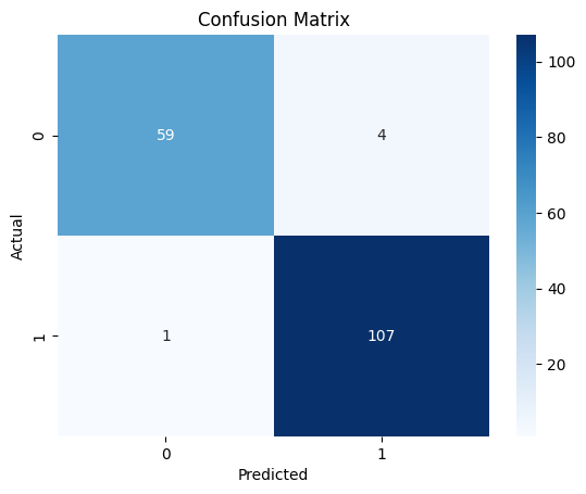
Figure 1: Confusion Matrix showing the distribution of true positives, true negatives, false positives, and false negatives.
3.2 ROC Curve and AUC
The ROC Curve plots the true positive rate against the false positive rate at various threshold settings. The AUC (Area Under the Curve) provides a single metric to summarize the performance across all thresholds.
Example Visualization:
from sklearn.datasets import make_classification
from sklearn.model_selection import train_test_split
from sklearn.ensemble import RandomForestClassifier
from sklearn.metrics import roc_curve, roc_auc_score

# Generate synthetic dataset
X, y = make_classification(n_samples=1000, n_features=20, n_informative=2, n_redundant=10, random_state=42)
X_train, X_test, y_train, y_test = train_test_split(X, y, test_size=0.3, random_state=42)

# Train model
model = RandomForestClassifier(random_state=42)
model.fit(X_train, y_train)
y_prob = model.predict_proba(X_test)[:, 1]

# ROC curve
fpr, tpr, thresholds = roc_curve(y_test, y_prob)
roc_auc = roc_auc_score(y_test, y_prob)

plt.plot(fpr, tpr, color='darkorange', lw=2, label=f'ROC curve (area = {roc_auc:.2f})')
plt.plot([0, 1], [0, 1], color='navy', lw=2, linestyle='--')
plt.xlim([0.0, 1.0])
plt.ylim([0.0, 1.0])
plt.xlabel('False Positive Rate')
plt.ylabel('True Positive Rate')
plt.title('Receiver Operating Characteristic')
plt.legend(loc='lower right')
plt.show()
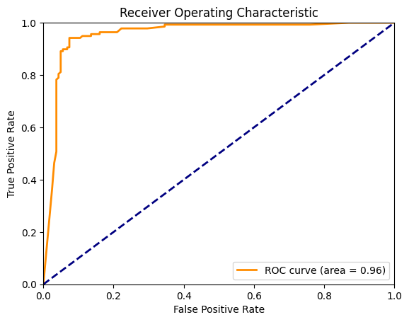
Figure 2: ROC Curve depicting the trade-off between true positive rate and false positive rate across different thresholds.
3.3 Precision-Recall Curve
The Precision-Recall Curve is particularly useful in imbalanced datasets. It plots precision versus recall, helping to visualize the trade-off between the two.
Example Visualization:
from sklearn.datasets import make_classification
from sklearn.model_selection import train_test_split
from sklearn.ensemble import RandomForestClassifier
from sklearn.metrics import precision_recall_curve, auc

# Generate imbalanced dataset
X, y = make_classification(n_samples=1000, n_features=20, n_informative=2, n_redundant=10, weights=[0.9, 0.1], random_state=42)
X_train, X_test, y_train, y_test = train_test_split(X, y, test_size=0.3, random_state=42)

# Train model
model = RandomForestClassifier(random_state=42)
model.fit(X_train, y_train)
y_prob = model.predict_proba(X_test)[:, 1]

# Precision-Recall curve
precision, recall, thresholds = precision_recall_curve(y_test, y_prob)
pr_auc = auc(recall, precision)

plt.plot(recall, precision, color='blue', lw=2, label=f'PR curve (area = {pr_auc:.2f})')
plt.xlabel('Recall')
plt.ylabel('Precision')
plt.title('Precision-Recall Curve')
plt.legend(loc='lower left')
plt.show()
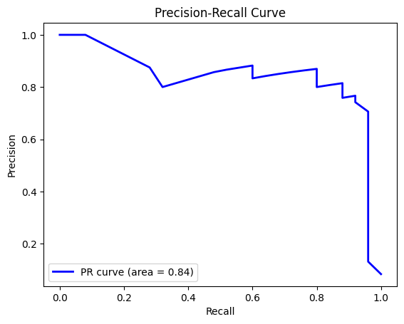
Figure 3: Precision-Recall Curve illustrating the trade-off between precision and recall, particularly useful for imbalanced datasets.
3.4 Calibration Plots
Calibration Plots compare predicted probabilities with actual outcomes, showing how well the predicted probabilities are calibrated. This is particularly useful in scenarios where you need well-calibrated probability estimates, such as in risk assessment.
Example Visualization:
from sklearn.datasets import make_classification
from sklearn.model_selection import train_test_split
from sklearn.ensemble import RandomForestClassifier
from sklearn.calibration import calibration_curve

# Generate dataset
X, y = make_classification(n_samples=1000, n_features=20, n_informative=2, n_redundant=10, random_state=42)
X_train, X_test, y_train, y_test = train_test_split(X, y, test_size=0.3, random_state=42)

# Train model
model = RandomForestClassifier(random_state=42)
model.fit(X_train, y_train)
y_prob = model.predict_proba(X_test)[:, 1]

# Calibration plot
prob_true, prob_pred = calibration_curve(y_test, y_prob, n_bins=10)

plt.plot(prob_pred, prob_true, marker='o', linewidth=2)
plt.plot([0, 1], [0, 1], linestyle='--', color='gray')
plt.xlabel('Mean Predicted Probability')
plt.ylabel('Fraction of Positives')
plt.title('Calibration Curve')
plt.show()
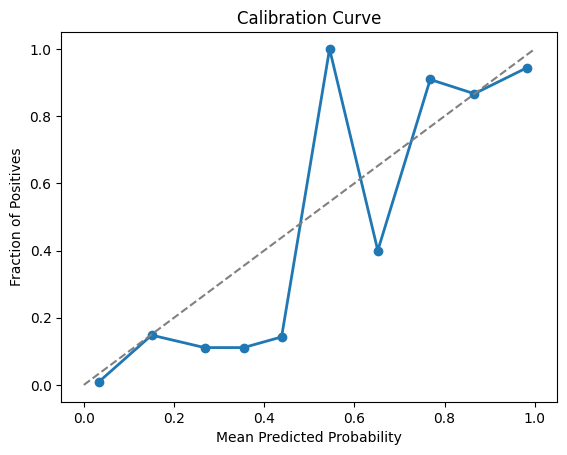
Figure 4: Calibration Curve showing the relationship between predicted probabilities and the actual fraction of positives.
3.5 Gain and Lift Charts
Gain and Lift Charts are used in marketing and customer analytics to measure the effectiveness of a model in identifying positive outcomes (e.g., customers likely to respond to a campaign).
- Gain Chart: Shows the cumulative percentage of positive responses captured as a function of the percentage of the population targeted.
- Lift Chart: Compares the gain of the model to the gain expected if no model was used.
** Example Visualization:**
import numpy as np
import matplotlib.pyplot as plt

# Simulate a dataset
np.random.seed(42)
n = 1000
y_true = np.random.binomial(1, 0.1, n)  # 10% positive class
y_score = np.random.rand(n)

# Sort the true labels based on the predicted scores
sorted_indices = np.argsort(-y_score)
y_true_sorted = y_true[sorted_indices]

# Calculate cumulative gains
cumulative_gains = np.cumsum(y_true_sorted) / sum(y_true_sorted)

# Calculate cumulative percentage of population targeted
population_percentage = np.arange(1, n+1) / n

# Gain Chart
plt.figure(figsize=(10, 6))
plt.plot(population_percentage, cumulative_gains, label='Gain Chart')
plt.plot([0, 1], [0, 1], linestyle='--', color='gray', label='Random Model')
plt.xlabel('Percentage of Population Targeted')
plt.ylabel('Cumulative Gain')
plt.title('Gain Chart')
plt.legend()
plt.show()

# Calculate lift
lift = cumulative_gains / population_percentage

# Lift Chart
plt.figure(figsize=(10, 6))
plt.plot(population_percentage, lift, label='Lift Chart')
plt.axhline(y=1, color='gray', linestyle='--', label='Random Model')
plt.xlabel('Percentage of Population Targeted')
plt.ylabel('Lift')
plt.title('Lift Chart')
plt.legend()
plt.show()
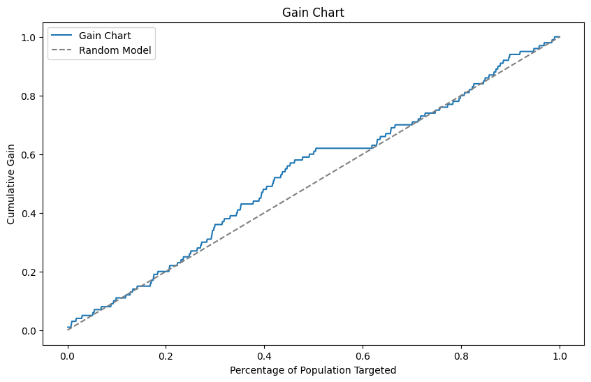 Figure 5: Gain Chart demonstrating the cumulative gain of positive outcomes as a function of the population targeted.
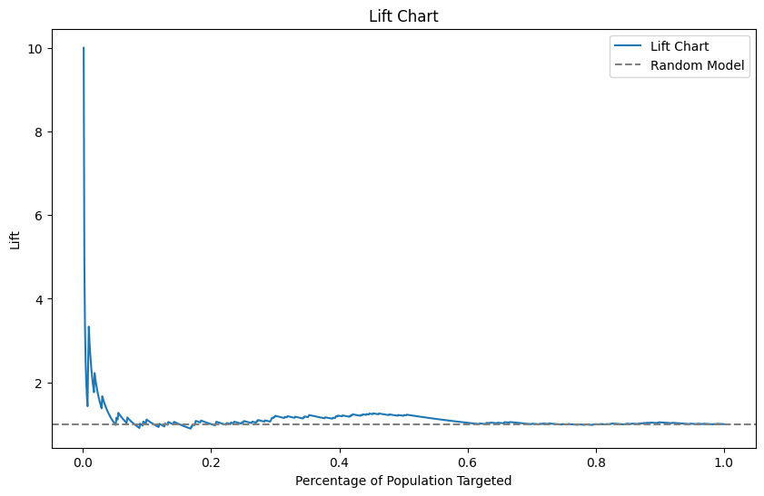 Figure 6: Lift Chart comparing the model's performance to random targeting, showing the effectiveness of the model in identifying positive outcomes.
4. Best Practices in Visualization
4.1 Choose the Right Visualization
Select the visualization that best represents the information you need. For example, use ROC curves for binary classification and Precision-Recall curves for imbalanced datasets.
4.2 Avoid Overloading with Information
While it's tempting to include multiple metrics in a single visualization, too much information can be overwhelming. Focus on the most relevant metrics for your specific use case.
4.3 Use Annotations for Clarity
Annotating charts with key values, such as AUC scores or threshold points, can help make the visualization more informative and easier to understand.
4.4 Consider Your Audience
Tailor your visualizations to your audience's level of expertise. For technical audiences, include more detailed charts like ROC curves. For non-technical audiences, simpler visualizations like confusion matrices might be more appropriate.
5. Conclusion
5.1 Recap of Key Concepts
Interpreting and visualizing evaluation metrics are crucial skills in data science. Visualization not only helps in understanding model performance but also in communicating insights effectively to various stakeholders.
5.2 Next Steps
In future articles, we’ll explore more advanced visualization techniques and how to use them in specific contexts, such as anomaly detection and time series analysis.
Interpreting and visualizing evaluation metrics are key steps in the data science process, helping you gain a deeper understanding of model performance and communicate findings more effectively. By mastering these techniques, you can enhance your ability to make informed decisions based on your models' outputs.