Advanced Visualization Concepts
As you advance in data visualization, it's important to understand more complex and specialized charts that can reveal deeper insights from your data. This article covers advanced visualization concepts, such as heatmaps, box plots, and the decision-making process for choosing the right type of chart.
1. Heatmaps
1.1 Overview
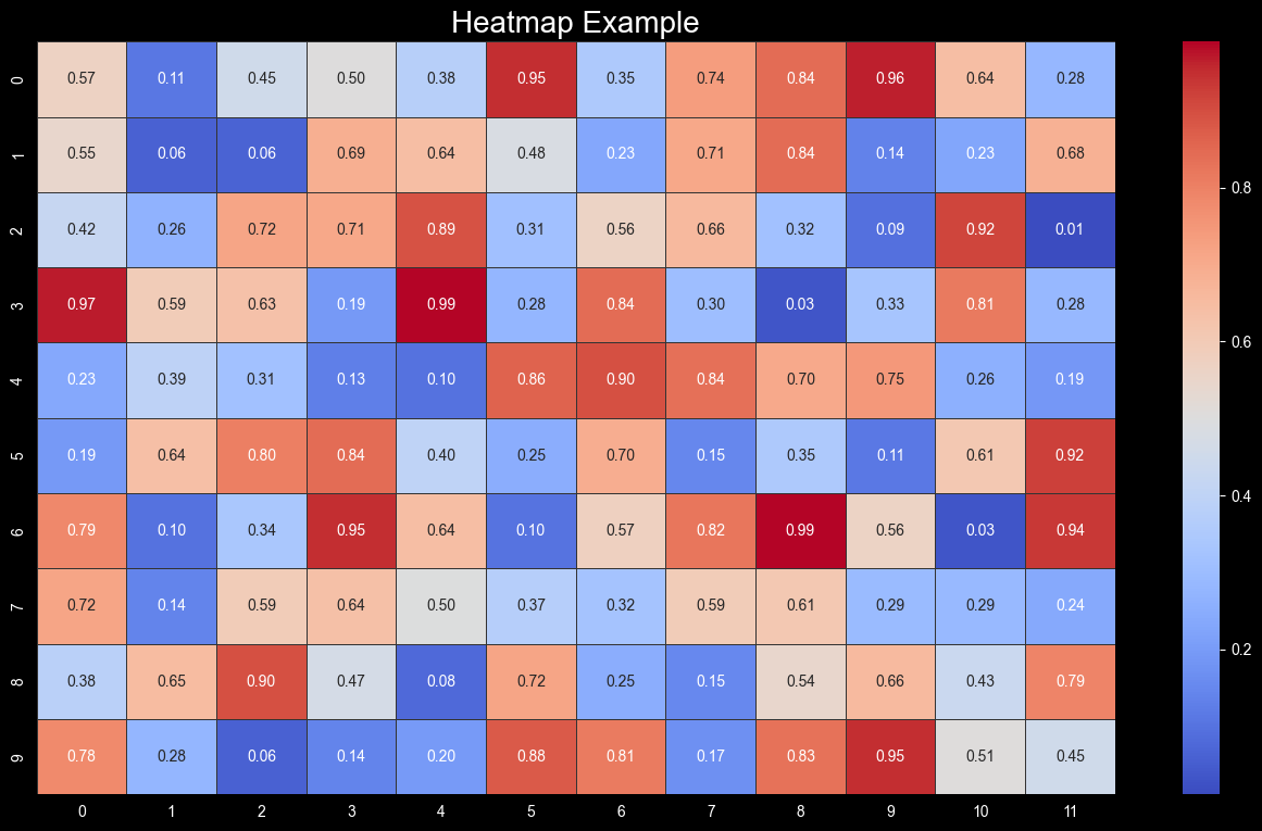
Heatmaps are used to visualize data matrices, where each cell's color represents the magnitude of the data point. They are especially useful for displaying correlation matrices and other grid-like data structures.
1.2 When to Use Heatmaps
- Visualizing Correlations: Heatmaps are ideal for showing the correlation between variables in a dataset.
- Grid-Based Data: Use heatmaps for data that is naturally structured in a grid, such as a confusion matrix or genetic data.
- Cluster Analysis: Heatmaps can help in identifying clusters or patterns within the data.
1.3 Best Practices
- Choose an Appropriate Color Palette: Select a color palette that clearly distinguishes between high and low values. Avoid using colors that could be confused with one another.
- Annotate When Necessary: If exact values are important, consider annotating the heatmap with the values.
- Use Grid Lines Wisely: Grid lines can help delineate cells but can also clutter the visualization if overused.

Figure 1: Heatmap Visualization showing a color-coded matrix representation of data with annotations, utilizing the "coolwarm" color scheme on a dark background.
2. Box Plots
2.1 Overview
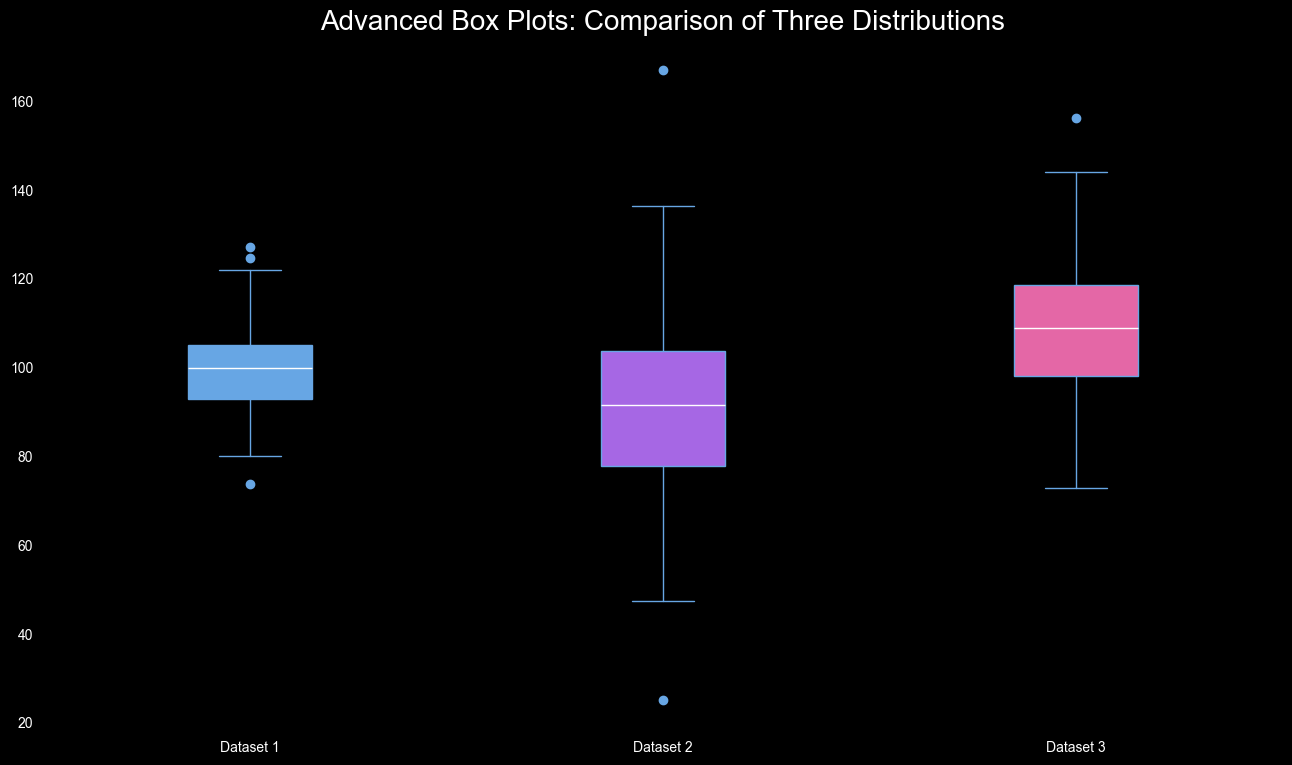
Box plots are used to visualize the distribution of a dataset by showing the minimum, first quartile, median, third quartile, and maximum values. They are particularly useful for identifying outliers and comparing distributions across different categories.
2.2 When to Use Box Plots
- Comparing Distributions: Box plots are ideal for comparing the distribution of a variable across several categories.
- Identifying Outliers: Use box plots to easily spot outliers in your data.
- Summarizing Large Datasets: Box plots provide a compact summary of the distribution of data, making them useful for large datasets.
2.3 Best Practices
- Use Consistent Scales: When comparing box plots, ensure they are on the same scale for easy comparison.
- Highlight Outliers: Outliers should be clearly marked to draw attention to them.
- Consider Using Jitter: If the data points are sparse, consider adding jitter to better visualize the spread of data points.

Figure 2: Box Plot Visualization showing the distribution of data with median, quartiles, and potential outliers on a dark background.
3. Violin Plots
3.1 Overview
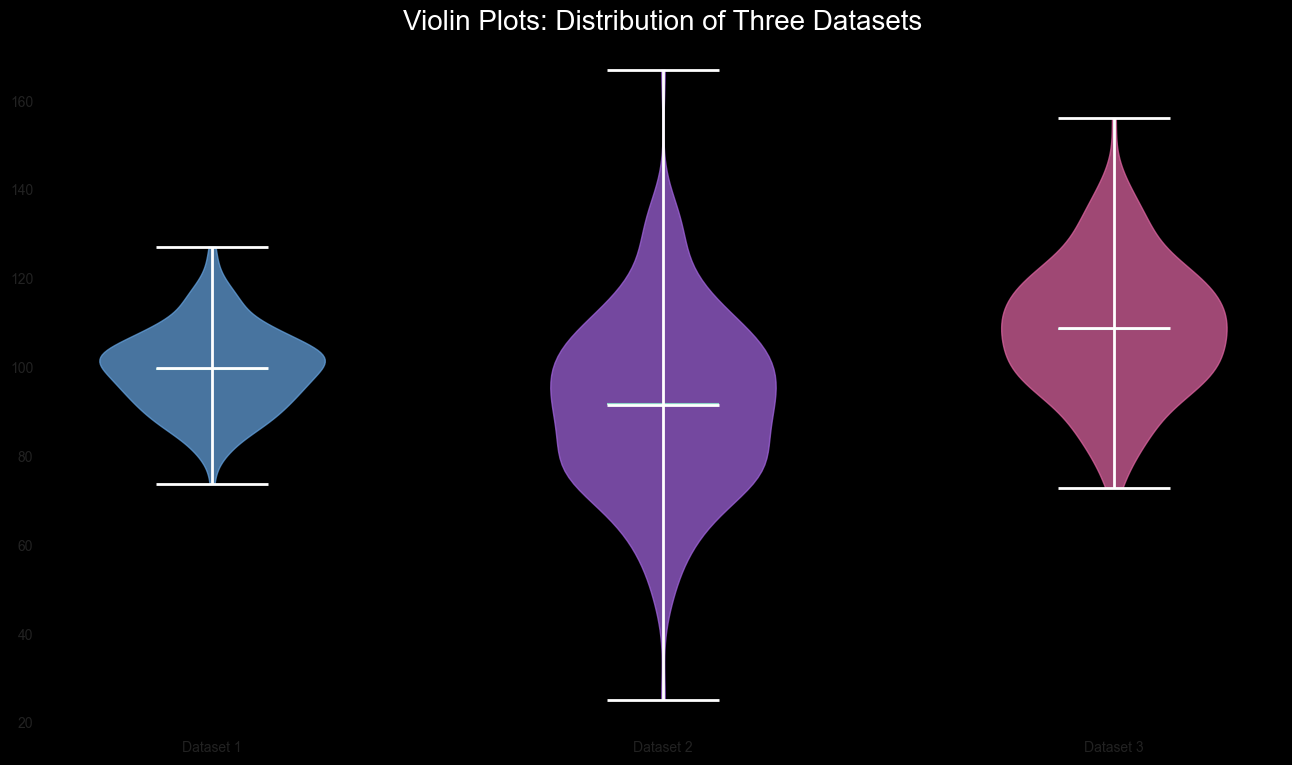
Violin plots are similar to box plots but include a kernel density estimate of the underlying data, providing more information about the distribution.
3.2 When to Use Violin Plots
- Detailed Distribution: Use violin plots when you need a detailed view of the distribution and density of the data.
- Comparing Groups: Like box plots, violin plots are useful for comparing distributions across multiple categories.
- Data with Multiple Modes: Violin plots are particularly useful for data that has more than one peak (mode) in the distribution.
3.3 Best Practices
- Combine with Box Plots: Consider combining violin plots with box plots to give a clearer picture of the data distribution.
- Use Different Colors for Clarity: Use different colors to distinguish between categories in violin plots.
- Avoid Overcomplicating: While violin plots provide a lot of information, too many in one plot can be overwhelming.

Figure 3: Violin Plot Comparison showing the distribution of three datasets with medians and means on a dark background.
4. Choosing the Right Chart
Selecting the appropriate chart for your data is crucial for effective communication. Here are some guidelines to help you choose:
4.1 Understand Your Data
- Categorical vs. Continuous: Determine whether your data is categorical, continuous, or both. This will narrow down your options.
- Single Variable vs. Multiple Variables: Decide if you are looking to analyze one variable or relationships between multiple variables.
4.2 Consider Your Audience
- Technical vs. Non-Technical Audience: Choose simpler, more straightforward charts for non-technical audiences. Technical audiences may appreciate more complex visualizations.
- Purpose of Visualization: Identify whether your goal is to explore the data, explain findings, or persuade others. This will influence the type of chart you choose.
4.3 Match the Chart to the Data
- Comparing Categories: Use bar charts or box plots.
- Showing Trends: Line charts are ideal.
- Exploring Relationships: Scatter plots, heatmaps, and pair plots work well.
5. Conclusion
Advanced visualization techniques such as heatmaps, box plots, and violin plots provide deeper insights into your data. By understanding when and how to use these charts, and by carefully choosing the right visualization for your data, you can create powerful, informative visualizations that convey complex information effectively. In the next article, we’ll discuss best practices in data visualization to ensure clarity, accuracy, and impact in your visualizations.