Introduction to Data Visualization and Common Types of Charts
Data visualization is a critical aspect of data science. It helps transform raw data into visual contexts, such as graphs or maps, making it easier to understand patterns, trends, and outliers. By using effective visualizations, data scientists can communicate insights more clearly and make data-driven decisions with greater confidence.
1. The Importance of Data Visualization
1.1 Simplifying Complex Data
Visualizations help break down complex datasets into more understandable visuals, making it easier to grasp difficult concepts or identify new patterns. This is particularly important when dealing with large datasets or communicating findings to non-technical stakeholders.
1.2 Revealing Patterns and Trends
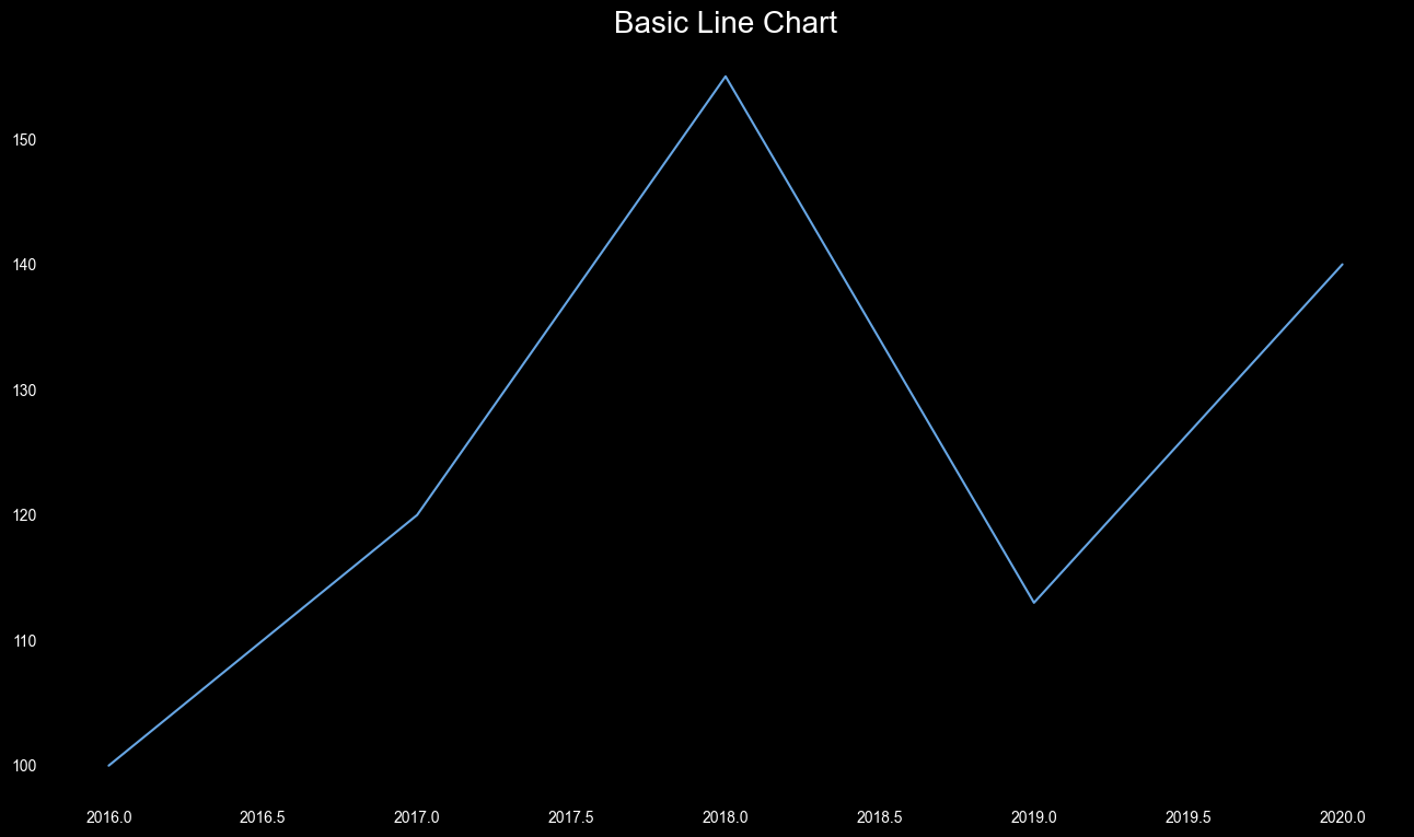
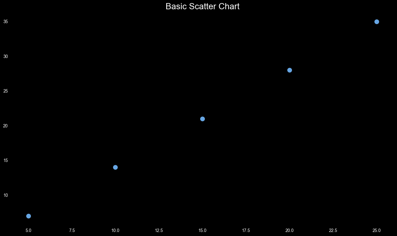
Charts and graphs can quickly reveal trends over time, correlations between variables, and distributions of data. For example, a line chart can show a trend in sales over several years, while a scatter plot can highlight the relationship between advertising spend and revenue.
1.3 Enhancing Data Exploration
Visual tools allow data scientists to explore their data interactively, making it easier to identify areas of interest for deeper analysis. This process often leads to new questions and insights that might not have been evident in raw data.
2. Overview of Different Types of Charts and Graphs
Understanding the various types of visualizations is key to selecting the right one for your data. Here’s a detailed overview of some common types:
2.1 Bar Charts
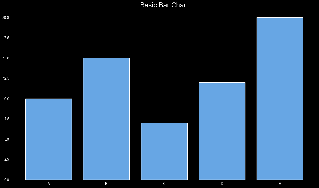
Overview: Bar charts are used to compare quantities across different categories. They are ideal for displaying data that can be split into discrete groups, such as sales numbers for different product lines.
When to Use Bar Charts:
- Comparing quantities across categories.
- Displaying data divided into distinct categories.
- Showing rank or order.
Best Practices:
- Keep bars uniform in width and arrange logically (e.g., descending order).
- Use a consistent color unless highlighting specific bars.
- Ensure clear labeling of bars and axes.

Figure 1: Simple Bar Chart.
2.2 Line Charts
Overview: Line charts are used to visualize data points over time or another continuous variable, making them ideal for tracking changes, trends, and patterns over periods.
When to Use Line Charts:
- Showing trends over time, such as stock prices or sales over months.
- For continuous data rather than discrete categories.
- Highlighting trends or changes over time.
Best Practices:
- Always place the time variable on the x-axis and the metric on the y-axis.
- Limit the number of lines to avoid clutter.
- Annotate key points to highlight significant data.

Figure 2: Simple Line Chart.
2.3 Pie Charts and Donut Charts
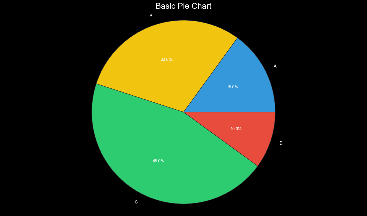
Overview: Pie charts show the proportion of a whole made up by its parts. Donut charts, a variation with a hole in the center, offer a similar perspective with more space for labels.
When to Use Pie Charts and Donut Charts:
- Showing proportions of a whole.
- Best with a limited number of categories (ideally fewer than five).
- Use when showing parts of a whole rather than comparing sizes of parts.
Best Practices:
- Limit the number of slices; too many make the chart hard to read.
- Ensure clear labeling, either directly on the chart or via a legend.
- Avoid 3D effects as they can distort the data.

Figure 3: Simple Pie Chart.
2.4 Scatter Plots
Overview: Scatter plots are used to visualize the relationship between two continuous variables, ideal for identifying correlations, trends, and outliers in the data.
When to Use Scatter Plots:
- Examining the relationship between two variables.
- Detecting outliers that don’t fit the general pattern.
- Revealing natural groupings or clusters within the data.
Best Practices:
- Add trend lines to highlight relationships between variables.
- Use different colors to group data points by a third variable, if applicable.
- Consider using transparency or a different plot type to avoid overplotting.

Figure 4: Simple Scatter Plot.
3. When to Use Specific Types of Visualizations
Choosing the right type of visualization depends on the nature of your data and the story you want to tell:
- Bar Charts: Best for comparing quantities across categories.
- Line Charts: Ideal for showing trends over time.
- Pie/Donut Charts: Use sparingly, only for showing simple proportions.
- Scatter Plots: Great for identifying relationships between two variables.
4. Conclusion
Data visualization is an essential skill in data science, enabling you to convey complex information effectively and make data-driven decisions. By understanding the different types of visualizations and their appropriate uses, you can create clear, accurate, and impactful visualizations. In the following articles, we’ll dive deeper into specific types of charts and graphs, exploring their uses and how to create them.