Categorical Data Visualization in Seaborn
Visualizing categorical data is crucial for understanding the relationships and patterns between different categories in your dataset. Seaborn, a powerful Python library for data visualization, offers a range of plots specifically designed for categorical data. In this article, we'll delve into how to create and customize bar plots, box plots, violin plots, strip plots, and swarm plots to effectively visualize categorical variables.
Introduction to Categorical Data Visualization
Categorical data refers to variables that contain label values rather than numeric values. Visualizing this type of data helps in:
- Identifying Patterns: Discovering trends and patterns within categories.
- Comparing Groups: Assessing differences between different groups or categories.
- Highlighting Outliers: Spotting anomalies or outliers within categorical groups.
- Communicating Insights: Effectively conveying findings to stakeholders.
Seaborn provides high-level functions that make it easy to create complex visualizations with simple code. Throughout this article, we'll use the tips dataset, which includes information about the total bill, tip amount, gender, day, and time of dining.
1. Bar Plots
Bar plots are fundamental for comparing quantitative data across categories. They display the central tendency (like mean or median) of a numerical variable.
1.1 Creating a Basic Bar Plot
The barplot() function computes and plots the average value for each category.
import seaborn as sns
import matplotlib.pyplot as plt

# Load the sample dataset
tips = sns.load_dataset("tips")

# Creating a basic bar plot
sns.barplot(x="day", y="total_bill", data=tips)
plt.title("Average Total Bill by Day")
plt.show()
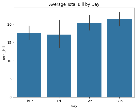
Figure 1: Bar Plot Example.
Explanation:
- x="day": Categories are days of the week.
- y="total_bill": Numeric variable to compute the average.
- data=tips: The dataset to use.
This plot shows the average total bill amount for each day, providing a quick comparison across days.
1.2 Adding Hue for Grouping
The hue parameter adds a second categorical variable for grouping.
# Bar plot with grouping by hue
sns.barplot(x="day", y="total_bill", hue="sex", data=tips)
plt.title("Average Total Bill by Day and Gender")
plt.show()
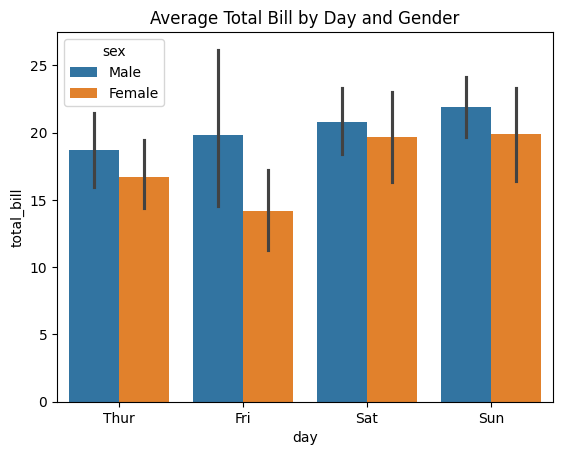
Figure 2: Bar Plot with Hue Example.
Explanation:
- hue="sex": Adds gender as a grouping variable.
- Bars: Now represent average total bills split by gender for each day.
This allows for a more detailed comparison, showing differences not just by day but also by gender.
1.3 Customizing Bar Plots
Customize bar plots to improve readability and aesthetics.
# Bar plot with custom color and error bars
sns.barplot(x="day", y="total_bill", hue="sex", data=tips, errorbar='sd', palette="pastel")
plt.title("Customized Bar Plot")
plt.show()
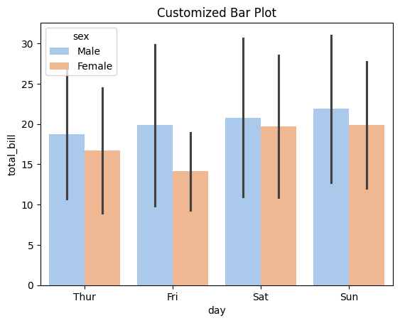
Figure 3: Bar Plot Customization Example.
Customization Options:
- errorbar='sd': Changes error bars to display standard deviation.
- palette="pastel": Applies a pastel color palette.
- plt.title(): Sets a custom title.
Customizations enhance the visual appeal and can make the plot easier to interpret.
2. Box Plots
Box plots visualize the distribution of quantitative data and identify outliers.
2.1 Creating a Basic Box Plot
# Creating a basic box plot
sns.boxplot(x="day", y="total_bill", data=tips)
plt.title("Box Plot of Total Bill by Day")
plt.show()
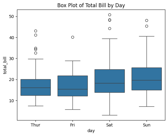
Figure 4: Box Plot Example.
Explanation:
- Box: Represents the interquartile range (IQR).
- Whiskers: Extend to show the rest of the distribution.
- Line in the Box: Indicates the median.
- Dots: Represent outliers.
Box plots provide a concise summary of the data's distribution for each category.
2.2 Grouping Data in Box Plots
Adding a grouping variable with hue.
# Box plot with grouping by hue
sns.boxplot(x="day", y="total_bill", hue="sex", data=tips)
plt.title("Box Plot of Total Bill by Day and Gender")
plt.show()
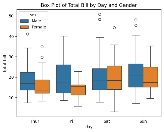
Figure 5: Box Plot Grouping Data Example.
Explanation:
- hue="sex": Adds gender grouping.
- Boxes: Now represent the distribution for males and females separately.
This helps in comparing the spread and central tendency between different groups within each category.
2.3 Customizing Box Plots
Adjust orientation and color for better visualization.
# Customized box plot with horizontal orientation
sns.boxplot(x="total_bill", y="day", hue="sex", data=tips, palette="Set3", orient="h")
plt.title("Customized Horizontal Box Plot")
plt.show()
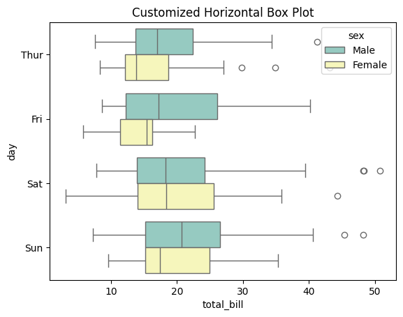
Figure 6: Box Plot Customizing Example.
Customization Options:
- orient="h": Sets the plot to horizontal orientation.
- palette="Set3": Applies a different color palette.
Horizontal orientation can be more suitable when category names are long or when you have many categories.
3. Violin Plots
Violin plots combine box plots and kernel density plots to show data distribution.
3.1 Creating a Basic Violin Plot
# Creating a basic violin plot
sns.violinplot(x="day", y="total_bill", data=tips)
plt.title("Violin Plot of Total Bill by Day")
plt.show()
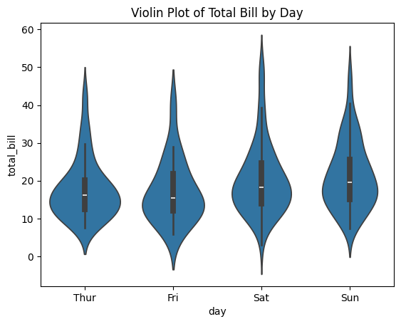
Figure 7: Violin Plot Example.
Explanation:
- Shape: Represents the data distribution's density.
- Width: Thicker areas indicate a higher concentration of data points.
Violin plots provide a deeper understanding of the data's distribution compared to box plots.
3.2 Grouping Data in Violin Plots
Using hue and split to compare distributions.
# Violin plot with grouping by hue
sns.violinplot(x="day", y="total_bill", hue="sex", data=tips, split=True)
plt.title("Violin Plot of Total Bill by Day and Gender")
plt.show()
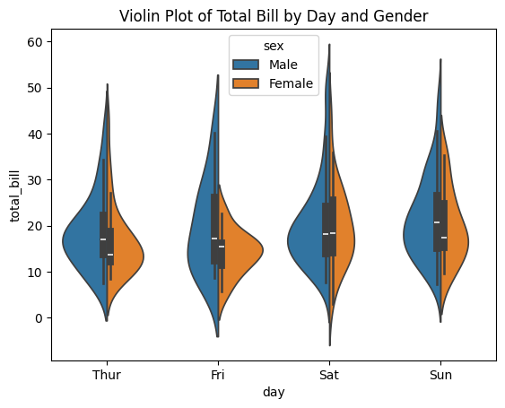
Figure 8: Violin Plot Grouping Example.
Explanation:
- split=True: Splits the violin to compare distributions side by side.
- hue="sex": Groups data by gender.
This visualization is effective for comparing distributions between two groups within each category.
3.3 Customizing Violin Plots
Modify inner representations and color palettes.
# Customized violin plot with different inner representation
sns.violinplot(x="day", y="total_bill", hue="sex", data=tips, split=True, inner="quartile", palette="muted")
plt.title("Customized Violin Plot")
plt.show()
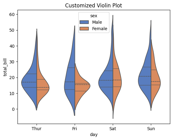
Figure 9: Customized Violin Plot Example.
Customization Options:
- inner="quartile": Displays quartiles inside the violin.
- palette="muted": Uses a muted color palette.
Customizing the inner representation adds more statistical information to the plot.
4. Strip Plots
Strip plots display all data points along a categorical axis.
4.1 Creating a Basic Strip Plot
# Creating a basic strip plot
sns.stripplot(x="day", y="total_bill", data=tips)
plt.title("Strip Plot of Total Bill by Day")
plt.show()
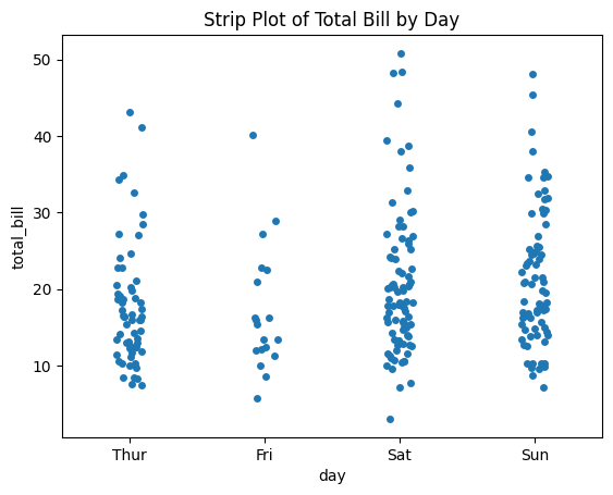
Figure 10: Strip Plot Example.
Explanation:
- Points: Each point represents an individual observation.
- Overlap: Points may overlap if data points have similar values.
Strip plots are useful for small datasets where individual observations are important.
4.2 Grouping Data in Strip Plots
Adding hue for grouping and dodge to separate points.
# Strip plot with grouping by hue
sns.stripplot(x="day", y="total_bill", hue="sex", data=tips, dodge=True)
plt.title("Strip Plot of Total Bill by Day and Gender")
plt.show()
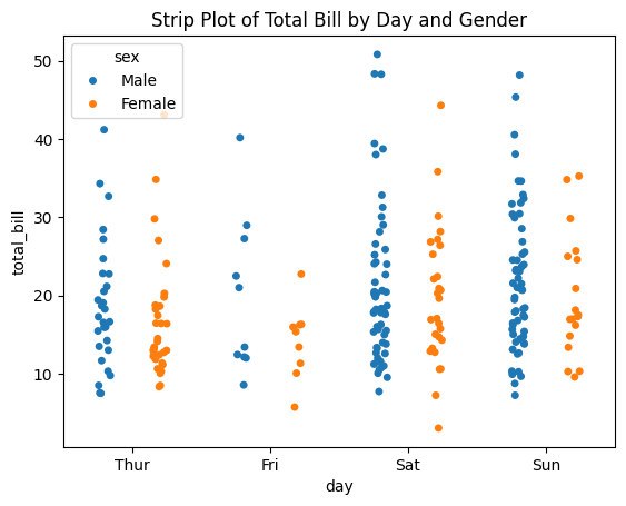
Figure 11: Strip Plot Grouping Example.
Explanation:
- dodge=True: Separates the points for each hue category.
- hue="sex": Groups data by gender.
This helps in distinguishing between different groups within each category.
4.3 Customizing Strip Plots
Enhance the plot by adjusting markers and transparency.
# Customized strip plot with jitter and transparency
sns.stripplot(x="day", y="total_bill", data=tips, jitter=True, alpha=0.6, palette="Dark2")
plt.title("Customized Strip Plot")
plt.show()
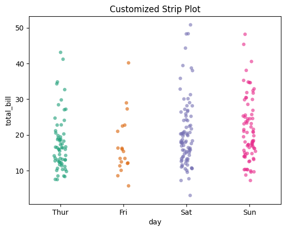
Figure 12: Customized Strip Plot Example.
Customization Options:
- jitter=True: Adds random noise to spread out overlapping points.
- alpha=0.6: Sets transparency to make overlapping points visible.
- palette="Dark2": Applies a dark color palette.
These adjustments improve the visibility of individual data points.
5. Swarm Plots
Swarm plots arrange data points to avoid overlap, providing a clear view of the distribution.
5.1 Creating a Basic Swarm Plot
# Creating a basic swarm plot
sns.swarmplot(x="day", y="total_bill", data=tips)
plt.title("Swarm Plot of Total Bill by Day")
plt.show()
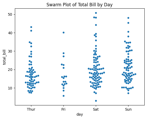
Figure 13: Swarm Plot Example.
Explanation:
- Points: Arranged to avoid overlap.
- Distribution: Provides a clear picture of data spread.
Swarm plots are ideal for visualizing all observations in a dataset.
5.2 Grouping Data in Swarm Plots
Using hue and dodge to group data.
# Swarm plot with grouping by hue
sns.swarmplot(x="day", y="total_bill", hue="sex", data=tips, dodge=True)
plt.title("Swarm Plot of Total Bill by Day and Gender")
plt.show()
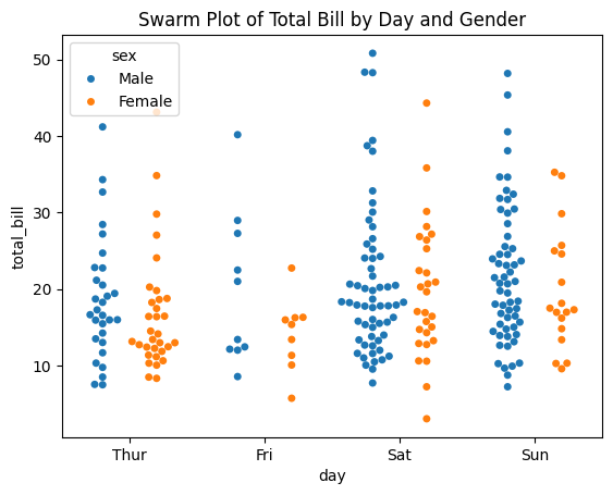
Figure 14: Grouped Swarm Plot Example.
Explanation:
- hue="sex": Adds gender grouping.
- dodge=True: Separates the groups within each category.
This provides a detailed comparison between groups without overlapping points.
5.3 Customizing Swarm Plots
Adjust markers and colors for emphasis.
# Customized swarm plot with different markers
sns.swarmplot(x="day", y="total_bill", data=tips, marker="o", color="purple")
plt.title("Customized Swarm Plot")
plt.show()
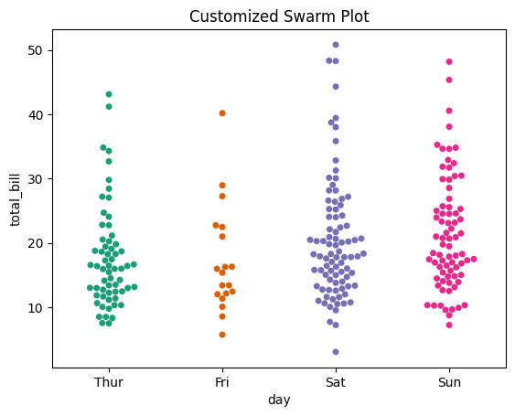
Figure 15: Customized Swarm Plot Example.
Customization Options:
- marker="o": Changes the marker style.
- color="purple": Sets a custom color.
These changes can make the plot more visually appealing and highlight specific data points.
Conclusion
Seaborn offers a rich set of tools for visualizing categorical data, each serving different purposes:
- Bar Plots: Compare central tendencies across categories.
- Box Plots: Summarize distributions and identify outliers.
- Violin Plots: Show detailed distribution shapes.
- Strip Plots: Display all individual observations.
- Swarm Plots: Arrange data points to avoid overlap, revealing distribution.
By mastering these plots, you can uncover deeper insights into your categorical variables and effectively communicate your findings. Remember to choose the plot type that best fits your data and the story you want to tell.
In the next article, we'll explore advanced customization techniques in Seaborn to further enhance your data visualizations.