Visualizing Distributions with Seaborn
Understanding the distribution of your data is a critical step in data analysis. Visualizing distributions helps in identifying patterns, detecting outliers, and understanding the underlying structure of your data. Seaborn, a powerful Python data visualization library, provides several tools to visualize distributions, including histograms, kernel density estimate (KDE) plots, and rug plots. In this article, we’ll explore how to create and customize these distribution plots using Seaborn.
1. Histograms
Histograms are a fundamental tool for visualizing the distribution of a single variable. They display the frequency or count of data points within specified intervals or "bins," giving insights into the data's central tendency, variability, and shape.
1.1 Creating a Basic Histogram
Seaborn makes it easy to create histograms using the histplot() function. This function computes and plots the histogram of a dataset.
import seaborn as sns
import matplotlib.pyplot as plt

# Load the sample dataset
tips = sns.load_dataset("tips")

# Creating a basic histogram
sns.histplot(tips["total_bill"])
plt.title("Histogram of Total Bill")
plt.show()
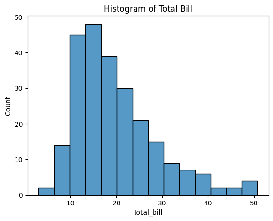
Figure 1: Histogram of Total Bill.
Explanation:
- tips["total_bill"]: Specifies the data to be plotted, which is the total bill amount from the
tipsdataset. - sns.histplot(): Generates a histogram of the specified data.
- The histogram shows how frequently different total bill amounts occur in the dataset.
This basic histogram provides a visual representation of the distribution of total bills, allowing you to quickly assess where most data points are concentrated.
1.2 Adjusting the Number of Bins
You can control the granularity of the histogram by adjusting the number of bins. Increasing the number of bins can reveal more detailed patterns, while decreasing them provides a broader overview.
# Histogram with more bins
sns.histplot(tips["total_bill"], bins=20)
plt.title("Histogram of Total Bill with More Bins")
plt.show()
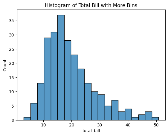
Figure 2: Histogram of Total Bill with More Bins.
Explanation:
- bins=20: Divides the data into 20 intervals.
- Adjusting the number of bins helps in identifying subtle features or gaps in the data.
By experimenting with the number of bins, you can gain different perspectives on the data distribution, which may help in detecting anomalies or specific patterns.
2. Kernel Density Estimate (KDE) Plots
KDE plots are used to estimate the probability density function of a continuous variable. They provide a smooth curve that represents the data distribution, making it easier to identify underlying patterns and trends.
2.1 Creating a Basic KDE Plot
Seaborn’s kdeplot() function creates KDE plots by computing the kernel density estimate of the data.
# Creating a basic KDE plot
sns.kdeplot(tips["total_bill"])
plt.title("KDE Plot of Total Bill")
plt.show()

Figure 3: KDE Plot of Total Bill.
Explanation:
- sns.kdeplot(): Generates a KDE plot for the specified data.
- The KDE plot provides a smooth estimate of the distribution, highlighting peaks and valleys.
This plot offers a continuous view of the data's distribution, which can be more informative than a histogram for certain analyses.
2.2 Customizing the Bandwidth
The bandwidth parameter controls the smoothness of the KDE curve. A smaller bandwidth captures more detail but may introduce noise, while a larger bandwidth smooths out minor fluctuations.
# KDE plot with custom bandwidth
sns.kdeplot(tips["total_bill"], bw_adjust=0.5)
plt.title("KDE Plot with Custom Bandwidth")
plt.show()
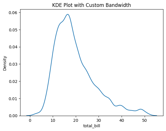
Figure 4: KDE Plot with Custom Bandwidth.
Explanation:
- bw_adjust=0.5: Adjusts the bandwidth to half of the default value, resulting in a more detailed curve.
- Fine-tuning the bandwidth allows you to focus on specific aspects of the data distribution.
By adjusting the bandwidth, you can explore the data at different levels of granularity, which may reveal hidden patterns or clusters.
2.3 Filling the Area Under the Curve
Filling the area under the KDE curve can enhance the visual appeal and make the plot easier to interpret.
# KDE plot with shaded area
sns.kdeplot(tips["total_bill"], fill=True)
plt.title("Shaded KDE Plot of Total Bill")
plt.show()
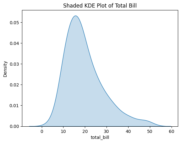
Figure 5: Shaded KDE Plot of Total Bill.
Explanation:
- fill=True: Fills the area under the KDE curve with color.
- The shaded area emphasizes the distribution and highlights the density regions.
This visual enhancement can make the plot more engaging and help in presentations or reports.
3. Rug Plots
Rug plots add small vertical lines at each data point along the x-axis, providing a simple visualization of individual observations. They are useful for seeing the exact positions of data points.
3.1 Creating a Basic Rug Plot
Rug plots can be created using the rugplot() function, which marks each data point along the axis.
# Creating a basic rug plot
sns.rugplot(tips["total_bill"])
plt.title("Rug Plot of Total Bill")
plt.show()
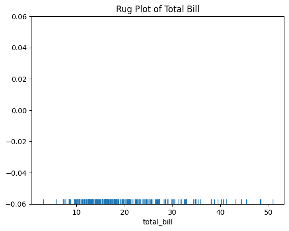
Figure 6: Rug Plot of Total Bill.
Explanation:
- Each tick represents an individual data point.
- Rug plots provide a clear view of data concentration and gaps.
This simple plot helps in identifying clusters and outliers in the data.
3.2 Combining Rug Plots with KDE
Rug plots are often combined with KDE plots to show individual data points alongside the estimated density.
# KDE plot with rug plot overlay
sns.kdeplot(tips["total_bill"])
sns.rugplot(tips["total_bill"])
plt.title("KDE Plot with Rug Plot of Total Bill")
plt.show()
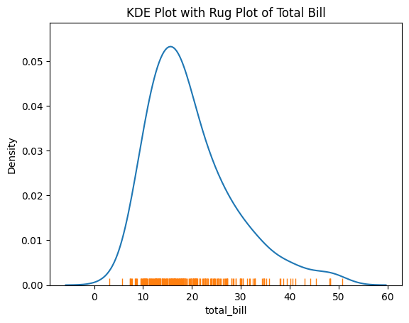
Figure 7: KDE Plot with Rug Plot of Total Bill.
Explanation:
- The KDE plot shows the overall distribution.
- The rug plot adds exact data points, enhancing interpretability.
Combining these plots provides both a smooth estimate and the raw data points, offering a comprehensive view of the data distribution.
4. Visualizing Bivariate Distributions
Seaborn also provides tools to visualize bivariate distributions, which show the relationship between two variables. This is essential for identifying correlations and interactions.
4.1 Creating a Joint Plot
The jointplot() function creates a plot that combines a scatter plot with histograms or KDE plots along the margins.
# Creating a joint plot with scatter and KDE
g = sns.jointplot(x="total_bill", y="tip", data=tips, kind="kde", fill=True)

# Adjusting the plot to make space for the title
plt.subplots_adjust(top=0.9)

# Adding the title
g.fig.suptitle("Joint Plot of Total Bill and Tip", fontsize=16)

plt.show()
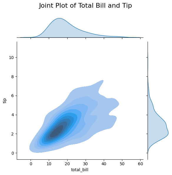
Figure 8: Joint Plot of Total Bill and Tip.
Explanation:
- x="total_bill", y="tip": Specifies the variables for the x and y axes.
- kind="kde": Uses a 2D KDE for the central plot.
- Marginal plots display the distributions of each variable.
This joint plot allows you to examine the relationship between total bill and tip amounts while also viewing their individual distributions.
4.2 Creating a Pair Plot
Pair plots visualize pairwise relationships across an entire dataset, providing a matrix of plots for each pair of variables.
# Creating a pair plot
sns.pairplot(tips)
plt.show()
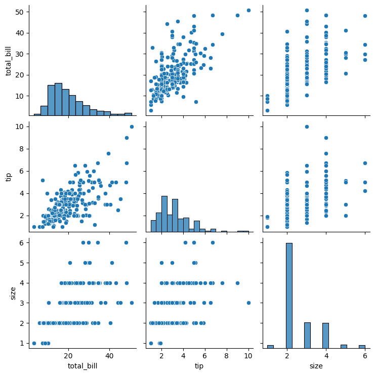
Figure 9: Pair Plot of the Tips Dataset.
Explanation:
- Diagonal plots show univariate distributions (histograms or KDE plots).
- Off-diagonal plots display bivariate relationships (scatter plots).
Pair plots are invaluable for exploratory data analysis, as they quickly reveal correlations and patterns among multiple variables.
5. Conclusion
Visualizing distributions is a key step in understanding your data, and Seaborn provides powerful tools for creating histograms, KDE plots, and rug plots. These visualizations help you:
- Uncover Patterns: Identify trends and common values within your data.
- Detect Outliers: Spot unusual observations that may require further investigation.
- Understand Data Structure: Gain insights into the shape, spread, and central tendencies of your data.
By mastering these techniques, you can perform more effective data analysis and make better-informed decisions based on your findings.
In the next article, we’ll explore how to visualize relationships between variables using Seaborn's specialized plots, such as scatter plots and line plots.