Getting Started with Seaborn
Seaborn is a powerful Python visualization library built on top of Matplotlib. It provides a high-level interface for drawing attractive and informative statistical graphics. Seaborn makes it easy to create complex plots with just a few lines of code, making it a popular choice for data visualization in data science.
1. Why Use Seaborn?
While Matplotlib offers extensive customization, it can sometimes be verbose for creating common statistical plots. Seaborn simplifies this process with built-in themes and high-level functions tailored for statistical visualization.
1.1 Key Features of Seaborn
-
Built-in Themes: Seaborn provides aesthetically pleasing themes for your plots, enhancing the visual appeal with minimal effort.
-
Statistical Functions: It includes functions to visualize distributions, relationships, and categorical data, making exploratory data analysis more straightforward.
-
Integration with pandas: Seaborn works seamlessly with pandas DataFrames, allowing you to visualize data directly from these structures without additional manipulation.
-
High-Level Interface: Offers an easy-to-use API for creating complex statistical plots, reducing the amount of code you need to write.
2. Installing Seaborn
To get started with Seaborn, you need to install it along with Matplotlib and pandas. You can install these libraries using pip:
pip install seaborn matplotlib pandas
Alternatively, if you're using Anaconda, you can install Seaborn using conda:
conda install seaborn
Ensure that you have these libraries installed before proceeding to create plots.
3. Basic Plotting with Seaborn
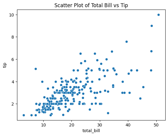
Seaborn's default theme and color palette are more refined than Matplotlib's, making your plots look better with minimal effort. Let's create a simple scatter plot to visualize the relationship between the total bill and tip amount from the tips dataset.
import seaborn as sns
import matplotlib.pyplot as plt

# Load the sample dataset
tips = sns.load_dataset("tips")

# Creating a basic scatter plot
sns.scatterplot(x="total_bill", y="tip", data=tips)

# Adding the title
plt.title("Scatter Plot of Total Bill vs Tip")

# Display the plot
plt.show()

Figure 1: Scatter Plot of Total Bill vs Tip using Seaborn.
Explanation:
- Importing Libraries: We import Seaborn as
snsand Matplotlib'spyplotmodule asplt. - Loading Data: The
tipsdataset is loaded usingsns.load_dataset("tips"). - Creating the Plot:
sns.scatterplot()creates a scatter plot withtotal_billon the x-axis andtipon the y-axis. - Adding a Title:
plt.title()adds a title to the plot. - Displaying the Plot:
plt.show()renders the plot.
This simple code generates a visually appealing scatter plot that helps you quickly identify patterns or correlations between variables.
4. Setting the Aesthetic Style
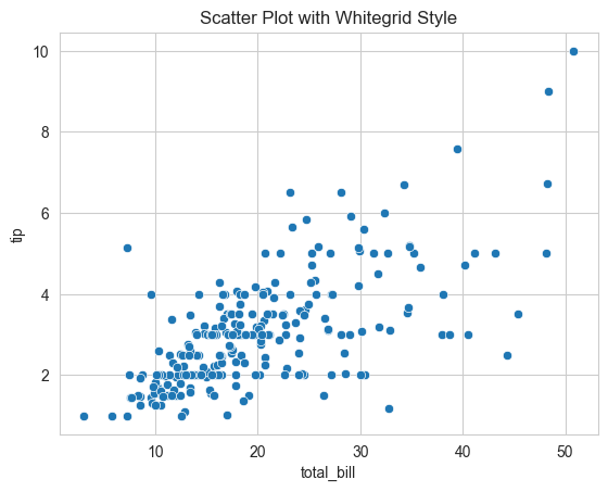
Seaborn allows you to set the overall aesthetic of your plots easily using the set_style() function. It offers several built-in themes: "darkgrid", "whitegrid", "dark", "white", and "ticks".
import seaborn as sns
import matplotlib.pyplot as plt

# Setting the aesthetic style
sns.set_style("whitegrid")

# Creating a basic plot with the new style
sns.scatterplot(x="total_bill", y="tip", data=tips)
plt.title("Scatter Plot with Whitegrid Style")
plt.show()

Figure 2: Scatter Plot with "whitegrid" Style.
Explanation:
- Setting the Style:
sns.set_style("whitegrid")changes the background and grid style of the plot. - The rest of the code remains the same, but the plot now reflects the chosen aesthetic.
Using different styles can make your plots more suitable for presentations or publications, depending on the context.
5. Customizing Color Palettes
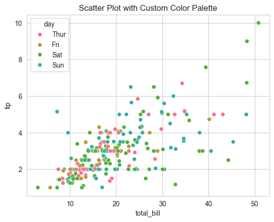
Seaborn also provides functions to customize color palettes, allowing you to enhance the visual differentiation between data points.
import seaborn as sns
import matplotlib.pyplot as plt

# Setting the aesthetic style
sns.set_style("whitegrid")

# Setting a custom color palette
sns.set_palette("husl")

# Creating a scatter plot with the custom palette
sns.scatterplot(x="total_bill", y="tip", data=tips, hue="day")

# Adding the title
plt.title("Scatter Plot with Custom Color Palette")

# Display the plot
plt.show()

Figure 3: Scatter Plot with Custom Color Palette.
Explanation:
- Setting the Palette:
sns.set_palette("husl")changes the color scheme of the plot. - Using
hue: Thehueparameter colors the data points based on thedayvariable. - This enhances the plot by adding another dimension of information through color coding.
Custom color palettes can make your visualizations more accessible and interpretable, especially when dealing with categorical data.
6. Working with DataFrames
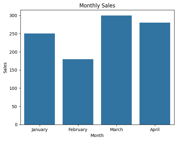
Seaborn works seamlessly with pandas DataFrames, allowing you to plot data directly without additional conversion or manipulation.
import seaborn as sns
import matplotlib.pyplot as plt
import pandas as pd

# Creating a sample DataFrame
data = {
    'Month': ['January', 'February', 'March', 'April'],
    'Sales': [250, 180, 300, 280]
}
df = pd.DataFrame(data)

# Creating a bar plot
sns.barplot(x="Month", y="Sales", data=df)
plt.title("Monthly Sales")
plt.show()

Figure 4: Bar Plot of Monthly Sales.
Explanation:
- Creating DataFrame: We create a pandas DataFrame with sample sales data.
- Plotting:
sns.barplot()generates a bar plot using the DataFrame columns. - This demonstrates how easily Seaborn integrates with pandas for data visualization tasks.
7. Conclusion
Seaborn is an excellent tool for creating statistical plots with minimal code. Its integration with pandas and built-in themes makes it a go-to choice for data scientists looking to create visually appealing and informative visualizations quickly. By leveraging Seaborn's capabilities, you can focus more on data analysis and less on the intricacies of plot customization.
In the next articles, we’ll dive deeper into specific types of plots you can create with Seaborn, such as distribution plots, relational plots, and categorical plots, and how to customize them to suit your data analysis needs.