Seaborn Pairplots and Heatmaps
Visualizing multivariate relationships and correlations is essential for data exploration and analysis. Seaborn provides powerful tools like pair plots and heatmaps, which allow you to explore relationships between multiple variables and visualize correlation matrices effectively. In this article, we'll explore how to create pair plots and heatmaps using Seaborn.
1. Pair Plots
Pair plots (also known as scatterplot matrices) are used to visualize the pairwise relationships between different variables in a dataset. They are especially useful for identifying trends and correlations in multivariate data.
1.1 Creating a Basic Pair Plot
The pairplot() function in Seaborn creates a grid of scatter plots for each pair of variables in the dataset.
import seaborn as sns
import matplotlib.pyplot as plt

# Load the sample dataset
tips = sns.load_dataset("tips")

# Creating a basic pair plot
sns.pairplot(tips)
plt.show()
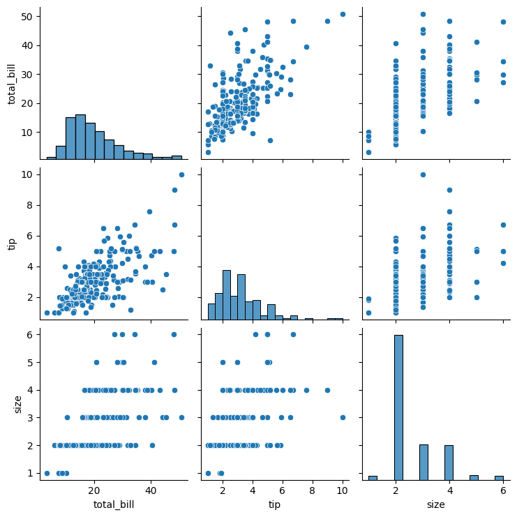
Figure 1: Basic Pair Plot Example.
1.2 Grouping Pair Plots with Hue
You can use the hue parameter to color the data points based on a categorical variable, allowing you to explore group differences.
# Pair plot grouped by the 'sex' column
sns.pairplot(tips, hue="sex")
plt.show()
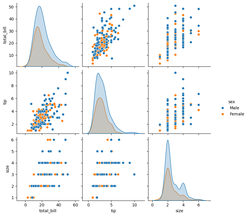
Figure 2: Pair Plot hue Example.
1.3 Customizing Pair Plots
You can customize pair plots by adding different plot types for the diagonal, adjusting markers, and limiting the variables displayed.
# Customizing the pair plot
sns.pairplot(tips, hue="sex", diag_kind="kde", markers=["o", "s"])
plt.show()
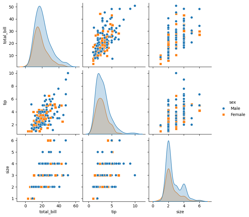
Figure 3: Customized Pair Plot Example.
1.4 Plotting Subsets of Variables
You can restrict the pair plot to a subset of variables by specifying which columns to include.
# Pair plot with a subset of variables
sns.pairplot(tips, vars=[ "tip", "size"], hue="sex")
plt.show()
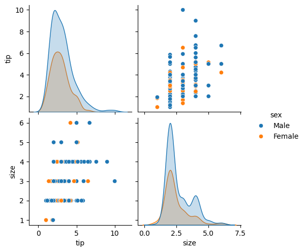
Figure 4: Pair Plot Variable Subset Rendered Example.
2. Heatmaps
Heatmaps are useful for visualizing data matrices and correlation matrices, providing a color-coded view of numerical values. Seaborn’s heatmap() function allows you to create highly customizable heatmaps.
2.1 Creating a Basic Heatmap
You can create a heatmap from a DataFrame or a 2D array.
# Load the flights dataset
flights = sns.load_dataset("flights").pivot(index="month", columns="year", values="passengers")


# Creating a basic heatmap
sns.heatmap(flights)
plt.title("Heatmap of Flights Data")
plt.show()
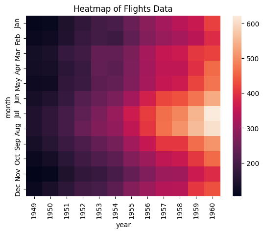
Figure 5: Basic Heatmap Example.
2.2 Adding a Color Map
You can apply different color maps to customize the appearance of the heatmap.
# Heatmap with a custom color map
sns.heatmap(flights, cmap="YlGnBu")
plt.title("Heatmap with Custom Color Map")
plt.show()
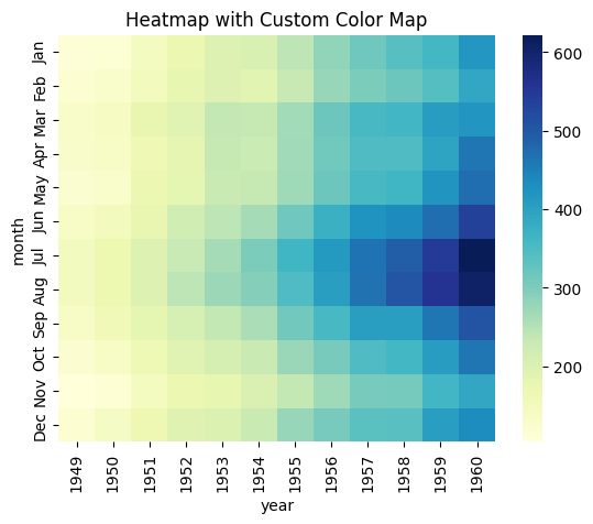
Figure 6: Heatmap with Custom Color Map Example.
2.3 Annotating the Heatmap
You can annotate the heatmap with the actual data values by using the annot parameter.
# Heatmap with annotations
sns.heatmap(flights, annot=True, fmt="d", cmap="coolwarm")
plt.title("Annotated Heatmap")
plt.show()
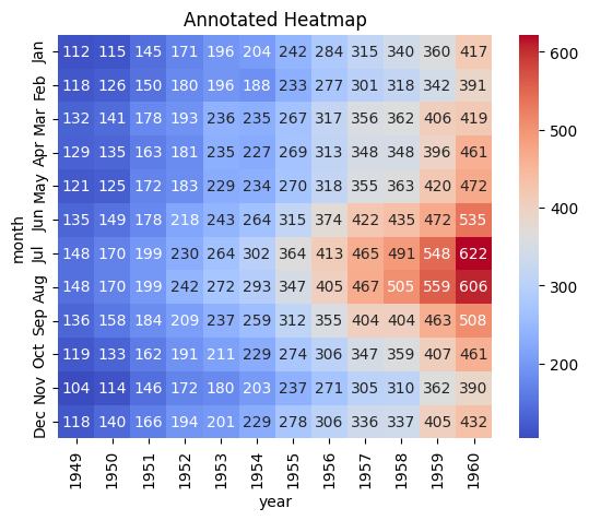
Figure 7: Heatmap with Annotations Example.
2.4 Displaying a Correlation Matrix with a Heatmap
Heatmaps are commonly used to visualize correlation matrices, where the color represents the strength of the correlation between variables.
# Load the tips dataset
tips = sns.load_dataset("tips")

# Select only the numeric columns
numeric_tips = tips.select_dtypes(include='number')

# Creating a correlation matrix
correlation_matrix = numeric_tips.corr()

# Heatmap of the correlation matrix
sns.heatmap(correlation_matrix, annot=True, cmap="RdBu", center=0)
plt.title("Correlation Matrix Heatmap")
plt.show()
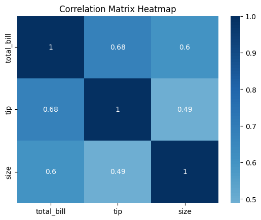
Figure 8: Heatmap Correlation Matrix Example.
3. Advanced Heatmap Customization
Seaborn offers several advanced customization options for heatmaps, including adjusting color bar labels, grid lines, and axis ticks.
3.1 Customizing the Color Bar
You can customize the color bar by adjusting its label, size, and orientation.
# Load the tips dataset
flights = sns.load_dataset("flights").pivot(index="month", columns="year", values="passengers")

# Customizing the color bar
sns.heatmap(flights, cmap="YlOrBr", cbar_kws={"label": "Number of Passengers", "orientation": "horizontal"})
plt.title("Heatmap with Custom Color Bar")
plt.show()
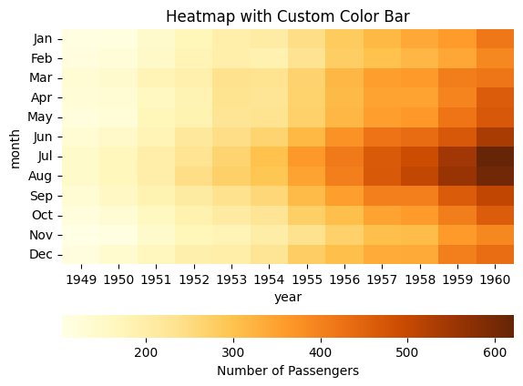
Figure 9: Heatmap Custom Color Bar Example.
3.2 Adding Grid Lines to a Heatmap
You can add or adjust grid lines in the heatmap using Seaborn’s linewidths parameter.
# Heatmap with grid lines
sns.heatmap(flights, cmap="Blues", linewidths=0.5)
plt.title("Heatmap with Grid Lines")
plt.show()
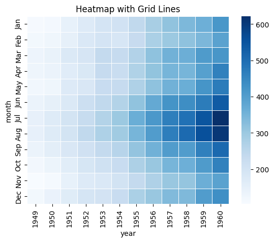
Figure 10: Heatmap Add Grid Lines Example.
3.3 Rotating Axis Labels
For better readability, you may need to rotate the axis labels.
# Rotating x and y axis labels
sns.heatmap(flights, cmap="Greens")
plt.xticks(rotation=45)
plt.yticks(rotation=0)
plt.title("Heatmap with Rotated Axis Labels")
plt.show()
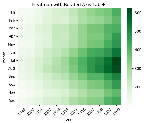
Figure 11: Heatmap Rotate Axis Labels Example.
4. Conclusion
Pair plots and heatmaps are essential tools for visualizing multivariate relationships and correlations in your data. Pair plots allow you to explore pairwise relationships, while heatmaps provide a clear and intuitive way to display data matrices and correlations. By mastering these visualization techniques, you can gain deeper insights into your data and communicate those insights more effectively.