Visualizing Relationships with Seaborn
Visualizing relationships between variables is a fundamental part of data analysis. Seaborn makes it easy to create informative plots that reveal correlations, trends, and patterns in your data. In this article, we'll explore how to use Seaborn to create scatter plots, line plots, and joint plots to visualize these relationships effectively.
1. Scatter Plots
Scatter plots are one of the most basic and commonly used plots to visualize the relationship between two continuous variables. They allow you to observe how one variable affects another and identify any potential correlations or outliers. Seaborn’s scatterplot() function simplifies the creation of scatter plots and offers extensive customization options.
1.1 Creating a Basic Scatter Plot
import seaborn as sns
import matplotlib.pyplot as plt

# Load the sample dataset
tips = sns.load_dataset("tips")

# Create a scatter plot
sns.scatterplot(x="total_bill", y="tip", data=tips)

# Adding the title
plt.title("Scatter Plot of Total Bill vs Tip")

# Display the plot
plt.show()
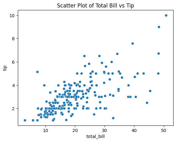
Figure 1: Scatter Plot of Total Bill vs Tip.
Explanation:
- x="total_bill": Sets the total bill amount as the x-axis variable.
- y="tip": Sets the tip amount as the y-axis variable.
- data=tips: Specifies the dataset to use.
This scatter plot shows the relationship between the total bill and the tip amount. Each point represents a single observation from the dataset. From the plot, you can observe that as the total bill increases, the tip amount tends to increase as well, indicating a positive correlation.
1.2 Adding Hue for Categorical Separation
You can use the hue parameter to add color coding based on a categorical variable, such as gender. This helps in distinguishing patterns within subgroups of your data.
# Scatter plot with hue for categorical separation
sns.scatterplot(x="total_bill", y="tip", hue="sex", data=tips)

# Adding the title
plt.title("Scatter Plot of Total Bill vs Tip by Gender")

# Display the plot
plt.show()
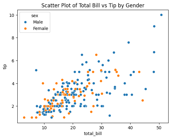
Figure 2: Scatter Plot of Total Bill vs Tip by Gender.
Explanation:
- hue="sex": Colors the data points based on the
sexcolumn. - The plot now shows different colors for male and female customers, allowing you to compare tipping behaviors between genders.
By adding the hue parameter, you can see if there are any noticeable differences in the tipping patterns of males and females. For example, you might observe that one gender tends to tip more for higher total bills.
1.3 Customizing Markers and Styles
Seaborn allows customization of markers and styles to differentiate groups within the data further. You can use the style parameter to change marker shapes based on another categorical variable.
# Scatter plot with custom markers and styles
sns.scatterplot(x="total_bill", y="tip", hue="sex", style="smoker", data=tips, markers=["o", "s"])

# Adding the title
plt.title("Scatter Plot with Custom Markers and Styles")

# Display the plot
plt.show()
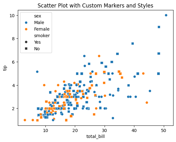
Figure 3: Scatter Plot with Custom Markers and Styles.
Explanation:
- style="smoker": Changes marker styles based on whether the customer is a smoker or not.
- markers=["o", "s"]: Specifies the marker types for the different categories in the
smokervariable.
In this plot, you can analyze how smoking status and gender relate to the total bill and tip amounts. For instance, you might notice differences in tipping behavior between smokers and non-smokers.
2. Line Plots
Line plots are useful for visualizing trends over time or continuous data. They are particularly effective when you have a time series or ordered data. Seaborn’s lineplot() function is designed to handle such data gracefully.
2.1 Creating a Basic Line Plot
# Load the sample dataset
fmri = sns.load_dataset("fmri")

# Create a basic line plot
sns.lineplot(x="timepoint", y="signal", data=fmri)
plt.title("Signal Over Time")
plt.show()
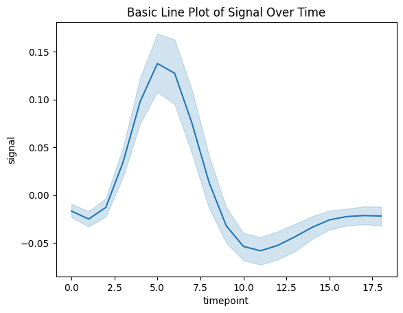
Figure 4: Basic Line Plot of Signal Over Time.
Explanation:
- x="timepoint": Represents the time variable on the x-axis.
- y="signal": Represents the signal measurement on the y-axis.
- data=fmri: Specifies the dataset to use.
This plot shows how the signal changes over time across all observations in the dataset.
2.2 Grouping Data with Hue
You can group data using the hue parameter to compare trends across different categories, such as different events or subjects.
# Line plot with grouping by hue
sns.lineplot(x="timepoint", y="signal", hue="event", data=fmri)
plt.title("Signal Over Time Grouped by Event")
plt.show()

Figure 5: Line Plot Grouped by Event.
Explanation:
- hue="event": Colors the lines based on the
eventvariable. - Each line represents the average signal over time for a specific event type.
Grouping by event allows you to compare how different events influence the signal over time.
2.3 Adding Confidence Intervals
Seaborn automatically adds confidence intervals to line plots, which represent the uncertainty around the mean estimate. You can customize or remove these intervals using the errorbar parameter.
# Line plot without confidence intervals
sns.lineplot(x="timepoint", y="signal", hue="event", data=fmri, errorbar=None)
plt.title("Line Plot Without Confidence Intervals")
plt.show()
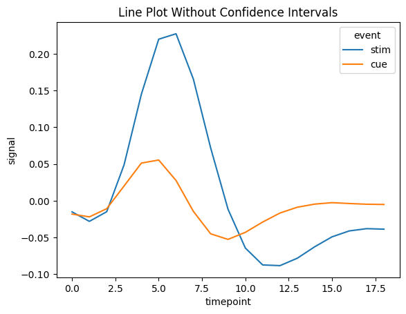
Figure 6: Line Plot Without Confidence Intervals.
Explanation:
- errorbar=None: Removes the confidence intervals from the plot.
Removing confidence intervals can make the plot cleaner and easier to read, especially when the confidence intervals overlap significantly.
3. Joint Plots
Joint plots combine scatter plots and histograms (or other plots) to provide a more comprehensive view of the relationship between two variables, including their distributions. Seaborn's jointplot() function creates these plots efficiently.
3.1 Creating a Basic Joint Plot
# Creating a basic joint plot
sns.jointplot(x="total_bill", y="tip", data=tips)

# Display the plot
plt.show()
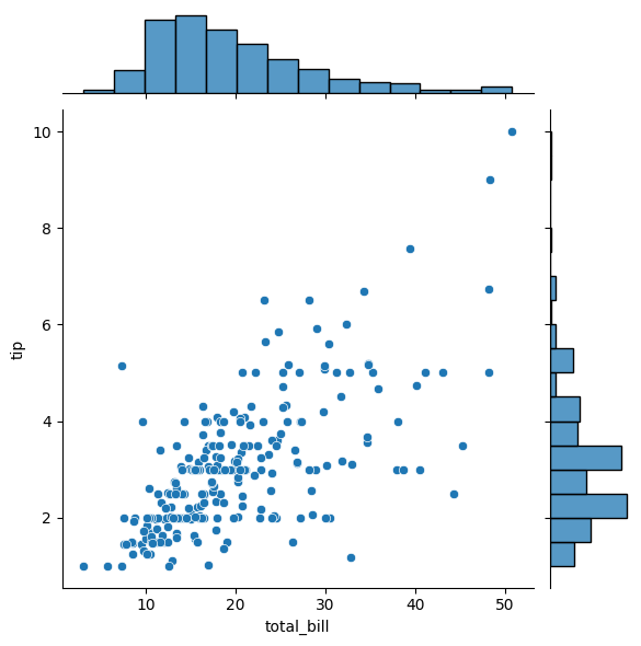
Figure 7: Basic Joint Plot of Total Bill vs Tip.
Explanation:
- x="total_bill" and y="tip": Specify the variables for the x and y axes.
- The central plot is a scatter plot, while the margins display histograms of each variable.
This plot helps you understand not only the relationship between the two variables but also their individual distributions.
3.2 Choosing Different Kinds of Joint Plots
You can change the kind of plot displayed in the joint plot to better suit your data.
# Joint plot with hex bins
sns.jointplot(x="total_bill", y="tip", data=tips, kind="hex")

# Display the plot
plt.show()
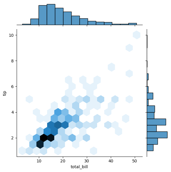
Figure 8: Joint Plot with Hex Bins.
Explanation:
- kind="hex": Changes the central plot to a hexbin plot, which is useful for large datasets to show density.
Other kinds include "reg" for regression plots and "kde" for kernel density estimates.
3.3 Adding Regression Lines
You can add a regression line to the joint plot to visualize trends more clearly.
# Joint plot with regression line
sns.jointplot(x="total_bill", y="tip", data=tips, kind="reg")

# Display the plot
plt.show()
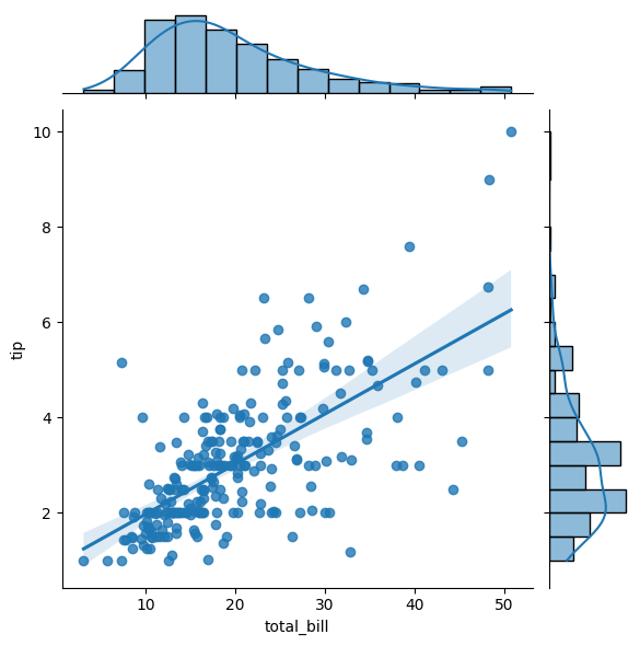
Figure 9: Joint Plot with Regression Line.
Explanation:
- kind="reg": Adds a regression line and confidence interval to the central plot.
This helps in identifying the nature of the relationship between the variables, whether it's linear or not.
4. Conclusion
Seaborn provides powerful tools for visualizing relationships between variables. By mastering scatter plots, line plots, and joint plots, you can gain deeper insights into your data and effectively communicate these insights to others. These plots help in:
- Identifying Correlations: Understanding how variables relate to each other.
- Detecting Trends: Observing changes over time or other continuous variables.
- Exploring Distributions: Analyzing the distribution of individual variables alongside their relationships.
In the next article, we'll explore how to visualize categorical data using Seaborn's specialized plots, such as bar plots, box plots, and violin plots.