Advanced Plot Types in Matplotlib
Beyond basic plots like line plots and bar plots, Matplotlib offers a variety of advanced plot types that can help you visualize complex datasets. In this article, we’ll explore how to create heatmaps, 3D plots, and contour plots using Matplotlib.
1. Heatmaps
Heatmaps are a powerful way to visualize data in a matrix format, where individual values are represented by color.
1.1 Creating a Simple Heatmap
You can create a heatmap using the plt.imshow() function.
import matplotlib.pyplot as plt
import numpy as np

# Sample data
data = np.random.rand(10, 10)

# Creating a heatmap
plt.imshow(data, cmap='viridis', aspect='auto')
plt.colorbar()
plt.title('Simple Heatmap')
plt.show()
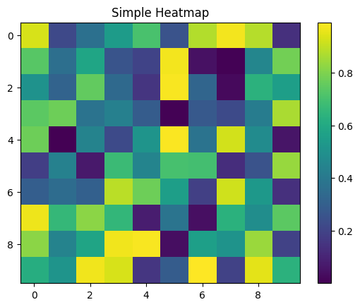
Figure 1: Simple Heatmap Example.
1.2 Adding Labels to a Heatmap
You can add labels to the rows and columns of the heatmap using plt.xticks() and plt.yticks().
# Adding labels to a heatmap
labels = ['A', 'B', 'C', 'D', 'E', 'F', 'G', 'H', 'I', 'J']
plt.imshow(data, cmap='viridis', aspect='auto')
plt.colorbar()
plt.xticks(ticks=np.arange(len(labels)), labels=labels)
plt.yticks(ticks=np.arange(len(labels)), labels=labels)
plt.title('Heatmap with Labels')
plt.show()

Figure 2: Simple Heatmap with Labels Example.
1.3 Customizing the Color Map
You can customize the color map to better suit your data or presentation style.
# Customizing the color map
plt.imshow(data, cmap='coolwarm', aspect='auto')
plt.colorbar()
plt.title('Heatmap with Custom Color Map')
plt.show()
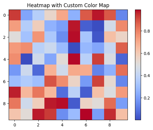
Figure 3: Heatmap with Custom Color Map Example.
2. 3D Plots
3D plots are useful for visualizing data with three dimensions. Matplotlib’s mpl_toolkits.mplot3d module provides tools for creating 3D plots.
2.1 Creating a Simple 3D Plot
You can create a 3D scatter plot using Axes3D.
from mpl_toolkits.mplot3d import Axes3D

# Sample data
x = np.random.rand(100)
y = np.random.rand(100)
z = np.random.rand(100)

# Creating a 3D scatter plot
fig = plt.figure()
ax = fig.add_subplot(111, projection='3d')
ax.scatter(x, y, z, c='blue', marker='o')
ax.set_title('3D Scatter Plot')
plt.show()
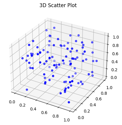
Figure 4: 3D Scatter Plot Example.
2.2 Creating 3D Surface Plots
Surface plots are useful for visualizing functions of two variables.
# Creating a 3D surface plot
x = np.linspace(-5, 5, 100)
y = np.linspace(-5, 5, 100)
X, Y = np.meshgrid(x, y)
Z = np.sin(np.sqrt(X**2 + Y**2))

fig = plt.figure()
ax = fig.add_subplot(111, projection='3d')
ax.plot_surface(X, Y, Z, cmap='viridis')
ax.set_title('3D Surface Plot')
plt.show()
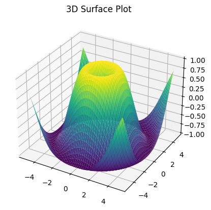
Figure 5: 3D Surface Plot Example.
2.3 Rotating 3D Plots
You can rotate 3D plots to view them from different angles using the view_init() function.
# Rotating a 3D plot
fig = plt.figure()
ax = fig.add_subplot(111, projection='3d')
ax.plot_surface(X, Y, Z, cmap='plasma')
ax.view_init(elev=30, azim=60)
ax.set_title('Rotated 3D Surface Plot')
plt.show()
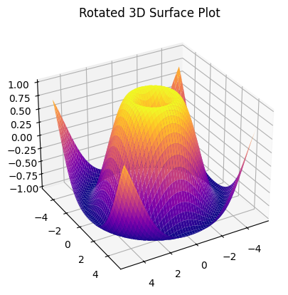
Figure 6: 3D Rotating Plot Example.
3. Contour Plots
Contour plots represent three-dimensional data in two dimensions, using contour lines to show different levels.
3.1 Creating a Simple Contour Plot
You can create a contour plot using the plt.contour() function.
# Creating a contour plot
x = np.linspace(-5, 5, 50)
y = np.linspace(-5, 5, 50)
X, Y = np.meshgrid(x, y)
Z = np.sin(np.sqrt(X**2 + Y**2))

plt.contour(X, Y, Z, levels=20, cmap='coolwarm')
plt.colorbar()
plt.title('Simple Contour Plot')
plt.show()
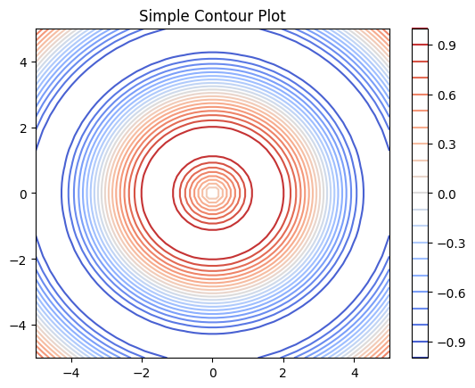
Figure 7: Contour Plot Example.
3.2 Filling Contour Plots
Filled contour plots use solid colors to fill the areas between contour lines.
# Creating a filled contour plot
plt.contourf(X, Y, Z, levels=20, cmap='viridis')
plt.colorbar()
plt.title('Filled Contour Plot')
plt.show()
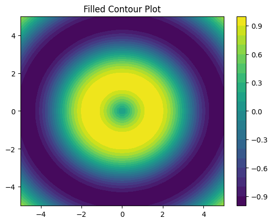
Figure 8: Filled Contour Plot Example.
3.3 Customizing Contour Plots
You can customize contour plots by adjusting the number of levels, color maps, and line styles.
# Customizing a contour plot
plt.contour(X, Y, Z, levels=10, colors='black', linestyles='dashed')
plt.contourf(X, Y, Z, levels=10, cmap='cool')
plt.colorbar()
plt.title('Customized Contour Plot')
plt.show()
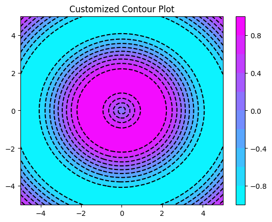
Figure 9: Customized Contour Plot Example.
4. Conclusion
Advanced plot types like heatmaps, 3D plots, and contour plots allow you to visualize more complex datasets and uncover deeper insights. These techniques are particularly useful in fields such as scientific computing, machine learning, and data analysis. In the next article, we'll explore how to save and export your plots in different formats using Matplotlib.