Styling and Formatting Plots in Matplotlib
Styling and formatting your plots can significantly enhance the readability and appeal of your visualizations. Matplotlib offers a wide range of options for customizing the appearance of plots, including changing colors, line styles, markers, and using predefined plot styles. In this article, we’ll explore these customization techniques to make your plots more informative and visually engaging.
1. Changing Colors
Colors play a crucial role in making plots visually appealing and easy to interpret. You can change the color of plot elements such as lines, bars, and markers.
1.1 Changing Line Colors
You can specify the color of a line using the color parameter in the plt.plot() function.
import matplotlib.pyplot as plt

# Sample data
x = [1, 2, 3, 4, 5]
y = [10, 20, 25, 30, 35]

# Changing the line color
plt.plot(x, y, color='red')
plt.title('Line Plot with Red Color')
plt.show()
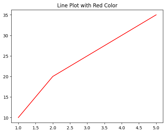
Figure 1: Line Chart with changed line color.
1.2 Using Hex Color Codes
You can also use hex color codes for more precise color control.
# Using a hex color code
plt.plot(x, y, color='#333333')
plt.title('Line Plot with Hex Color Code')
plt.show()
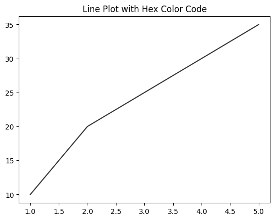
Figure 2: Line Color change with Hex Color Code.
1.3 Applying Colors to Bar Plots
For bar plots, you can specify the color of each bar.
# Sample data
categories = ['A', 'B', 'C', 'D']
values = [5, 7, 8, 6]

# Changing bar colors
plt.bar(categories, values, color=['blue', 'green', 'red', 'purple'])
plt.title('Bar Plot with Custom Colors')
plt.show()
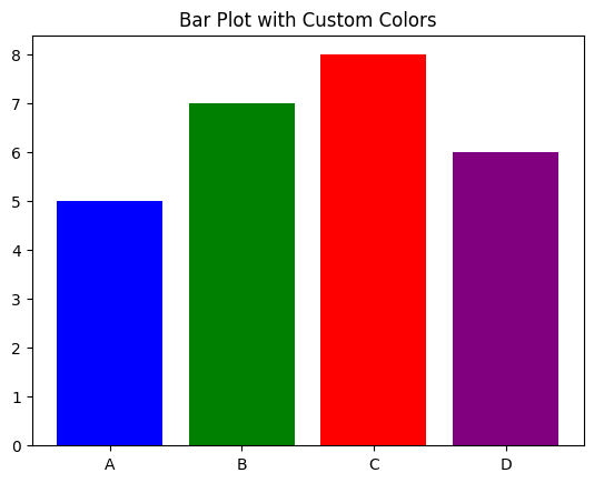
Figure 3: Colored Bar Plots.
2. Changing Line Styles and Markers
Line styles and markers can be customized to differentiate between multiple data series or to highlight specific points.
2.1 Changing Line Styles
You can change the style of a line (e.g., dashed, dotted) using the linestyle parameter.
# Changing the line style
plt.plot(x, y, linestyle='--')
plt.title('Dashed Line Plot')
plt.show()
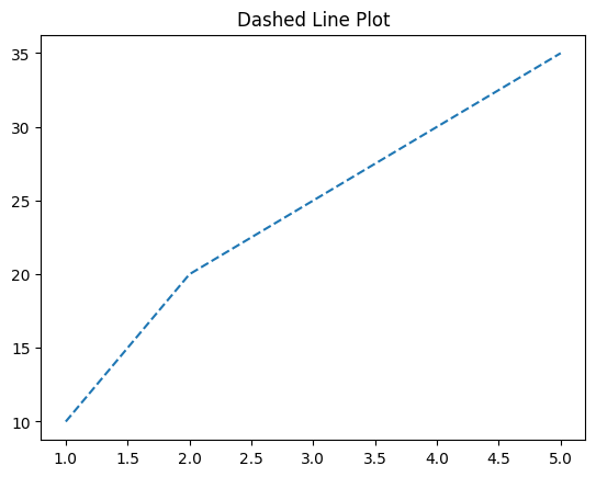
Figure 4: Dashed Line Plot Example
2.2 Adding Markers
Markers can be added to indicate individual data points on a line.
# Adding markers to a line plot
plt.plot(x, y, marker='o', linestyle='-', color='purple')
plt.title('Line Plot with Markers')
plt.show()
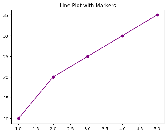
Figure 5: Line Plot Markers Example.
2.3 Combining Line Styles and Markers
You can combine line styles and markers to create more complex visualizations.
# Combining line style and markers
plt.plot(x, y, linestyle='-.', marker='s', color='green')
plt.title('Line Plot with Combined Style')
plt.show()
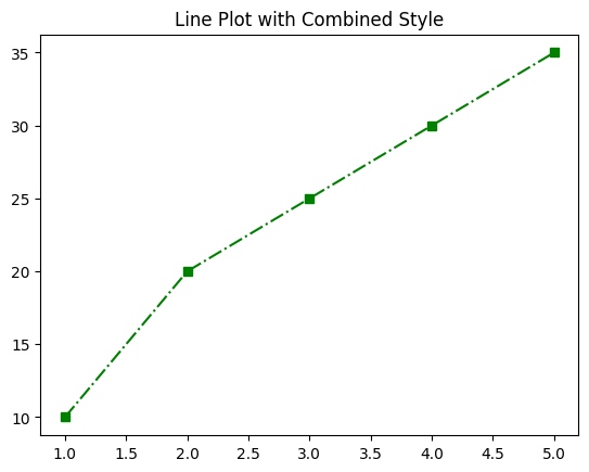
Figure 6: Line Plot Dashed Line and Markers Combined Example.
3. Using Predefined Plot Styles
Matplotlib provides several predefined styles that you can apply to your plots for consistent and aesthetically pleasing visualizations.
3.1 Listing Available Styles
You can list all available styles using plt.style.available.
# Listing all available styles
print(plt.style.available)

# Output:
# ['Solarize_Light2', '_classic_test_patch', '_mpl-gallery', '_mpl-gallery-nogrid', 'bmh', 'classic', 'dark_background', 'fast', 'fivethirtyeight', 'ggplot', 'grayscale', 'seaborn-v0_8', 'seaborn-v0_8-bright', 'seaborn-v0_8-colorblind', 'seaborn-v0_8-dark', 'seaborn-v0_8-dark-palette', 'seaborn-v0_8-darkgrid', 'seaborn-v0_8-deep', 'seaborn-v0_8-muted', 'seaborn-v0_8-notebook', 'seaborn-v0_8-paper', 'seaborn-v0_8-pastel', 'seaborn-v0_8-poster', 'seaborn-v0_8-talk', 'seaborn-v0_8-ticks', 'seaborn-v0_8-white', 'seaborn-v0_8-whitegrid', 'tableau-colorblind10']
3.2 Applying a Style
You can apply a style to your plot using plt.style.use().
# Applying a predefined style
plt.style.use('ggplot')
plt.plot(x, y)
plt.title('Plot with ggplot Style')
plt.show()
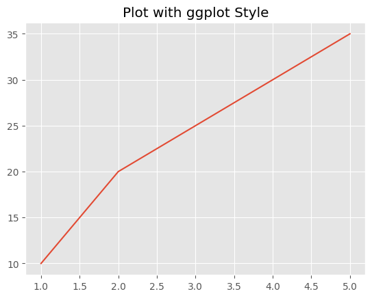
Figure 7: Plot with ggplot Style Example.
4. Customizing Fonts and Text
Fonts and text elements can be customized to improve the readability and professionalism of your plots.
4.1 Changing Font Properties
You can customize font properties such as size, weight, and family.
# Changing font properties
plt.plot(x, y)
plt.title('Custom Font Properties', fontsize=14, fontweight='bold', fontfamily='serif')
plt.xlabel('X-axis', fontsize=12)
plt.ylabel('Y-axis', fontsize=12)
plt.show()
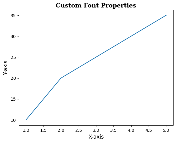
Figure 8: Plot with Custom Font Example.
4.2 Rotating and Aligning Text
Rotating and aligning text can help prevent overlap and improve the layout of your plots.
# Rotating x-axis labels
plt.plot(x, y)
plt.title('Rotated X-axis Labels')
plt.xlabel('X-axis')
plt.ylabel('Y-axis')
plt.xticks(rotation=45, ha='right')
plt.show()
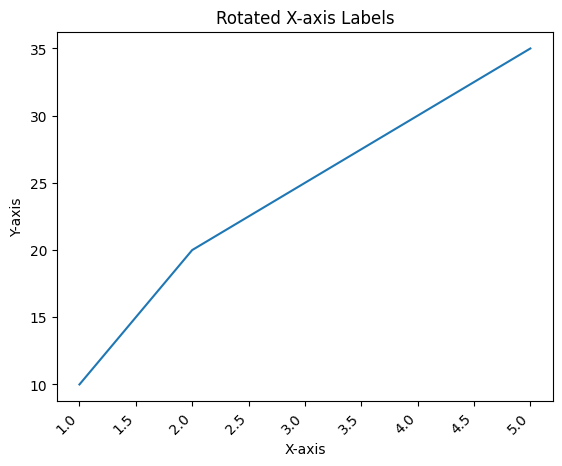
Figure 8: Plot with rotated Axis Example.
5. Applying Grid Styles
Grid lines can be customized to enhance the clarity of your plot.
5.1 Customizing Grid Lines
You can change the style, color, and width of grid lines.
# Customizing grid lines
plt.plot(x, y)
plt.title('Custom Grid Lines')
plt.grid(True, linestyle='--', color='gray', linewidth=0.7)
plt.show()
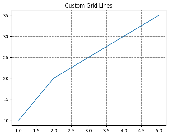
Figure 9: Plot with Custom Grid Lines Example.
5.2 Removing Grid Lines
If grid lines are not needed, you can remove them entirely.
# Removing grid lines
plt.plot(x, y)
plt.title('No Grid Lines')
plt.grid(False)
plt.show()
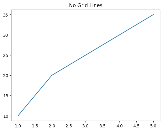
Figure 10: Plot with no Grid Lines Example.
6. Conclusion
Styling and formatting your plots in Matplotlib allows you to create visualizations that are not only informative but also visually appealing. By mastering these customization techniques, you can make your plots stand out and effectively communicate your data insights. In the next article, we'll explore how to add annotations and text to your plots to highlight important data points.