Customizing Plots in Matplotlib
Creating a basic plot is just the first step in data visualization. Customizing your plots allows you to make them clearer, more informative, and visually appealing. In this article, we'll explore how to add titles, labels, legends, and modify axes in Matplotlib.
1. Adding Titles and Labels
Titles and labels are essential for providing context to your plots, helping the viewer understand what the data represents.
1.1 Adding a Title
You can add a title to your plot using the plt.title() function.
import matplotlib.pyplot as plt

# Sample data
x = [1, 2, 3, 4, 5]
y = [10, 20, 25, 30, 35]

# Creating a line plot with a title
plt.plot(x, y)
plt.title('Sales Over Time')
plt.show()
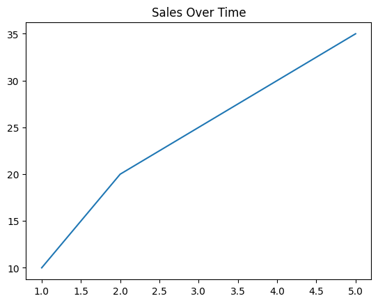
Figure 1: Plot with Title
1.2 Adding Axis Labels
Axis labels can be added using the plt.xlabel() and plt.ylabel() functions.
# Adding axis labels
plt.plot(x, y)
plt.title('Sales Over Time')
plt.xlabel('Time (months)')
plt.ylabel('Sales')
plt.show()
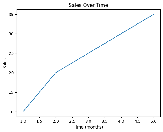
Figure 2: Plot with Axis Labels
2. Adding Legends
Legends help to identify different data series in your plot, which is especially useful when you're plotting multiple datasets.
2.1 Adding a Legend to a Single Plot
You can add a legend using the plt.legend() function.
# Plotting multiple datasets with a legend
plt.plot(x, y, label='Product A')
plt.plot(x, [15, 25, 35, 45, 55], label='Product B')
plt.title('Sales Comparison')
plt.xlabel('Time (months)')
plt.ylabel('Sales')
plt.legend()
plt.show()
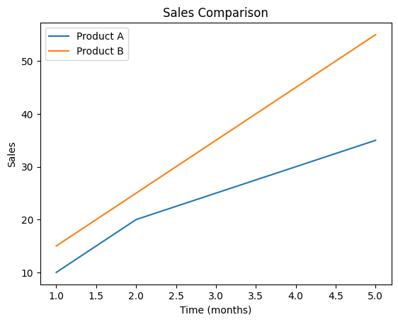
Figure 3: Plot with Legend
2.2 Positioning the Legend
You can position the legend using the loc parameter in plt.legend().
# Positioning the legend
plt.plot(x, y, label='Product A')
plt.plot(x, [15, 25, 35, 45, 55], label='Product B')
plt.title('Sales Comparison')
plt.xlabel('Time (months)')
plt.ylabel('Sales')
plt.legend(loc='lower right')
plt.show()
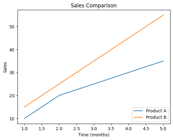
Figure 4: Plot with Positioned Legend
3. Modifying Axes
Modifying axes can help you better control how data is presented, making plots more readable.
3.1 Setting Axis Limits
You can set the limits of the axes using plt.xlim() and plt.ylim().
# Setting axis limits
plt.plot(x, y)
plt.title('Sales Over Time')
plt.xlabel('Time (months)')
plt.ylabel('Sales')
plt.xlim(0, 6)
plt.ylim(0, 40)
plt.show()
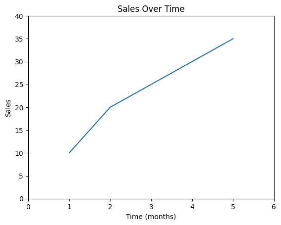
Figure 5: Plot with Limited Axis
3.2 Adjusting the Scale of Axes
You can change the scale of the axes (e.g., logarithmic scale) using plt.xscale() and plt.yscale().
# Using logarithmic scale for y-axis
plt.plot(x, y)
plt.title('Sales Over Time (Log Scale)')
plt.xlabel('Time (months)')
plt.ylabel('Sales')
plt.yscale('log')
plt.show()
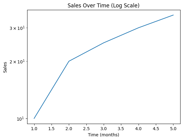
Figure 6: Plot with Ajusted Axis
3.3 Rotating Tick Labels
Sometimes, tick labels on the axes can overlap or be difficult to read. You can rotate them for better visibility.
# Rotating x-axis tick labels
plt.plot(x, y)
plt.title('Sales Over Time')
plt.xlabel('Time (months)')
plt.ylabel('Sales')
plt.xticks(rotation=45)
plt.show()
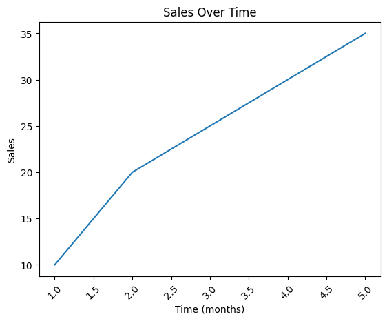
Figure 7: Plot with Rotated Axis
4. Adding Gridlines
Gridlines can make your plot easier to read by providing a reference for the data points.
4.1 Adding and Customizing Gridlines
You can add gridlines using the plt.grid() function, and customize them by specifying the line style, color, and width.
# Adding gridlines
plt.plot(x, y)
plt.title('Sales Over Time')
plt.xlabel('Time (months)')
plt.ylabel('Sales')
plt.grid(True, linestyle='--', color='gray', linewidth=0.5)
plt.show()
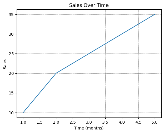
Figure 8: Plot with Grid Lines
5. Adding Annotations
Annotations allow you to highlight specific points or add notes directly on your plot.
5.1 Adding Text Annotations
You can add text annotations to specific points using the plt.text() function.
# Adding a text annotation
plt.plot(x, y)
plt.title('Sales Over Time')
plt.xlabel('Time (months)')
plt.ylabel('Sales')
plt.text(3, 25, 'Sales peak', fontsize=12, color='red')
plt.show()
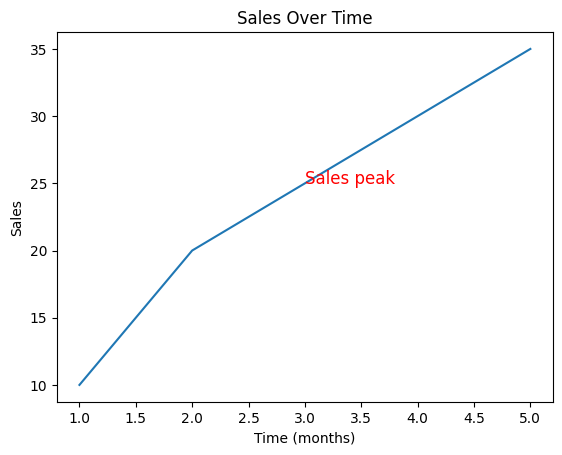
Figure 9: Plot with Annotation
5.2 Using Arrows for Annotations
You can also add arrows to annotations for better clarity using the plt.annotate() function.
# Adding an annotation with an arrow
plt.plot(x, y)
plt.title('Sales Over Time')
plt.xlabel('Time (months)')
plt.ylabel('Sales')
plt.annotate('Sales peak', xy=(3, 25), xytext=(4, 20),
             arrowprops=dict(facecolor='black', shrink=0.05))
plt.show()
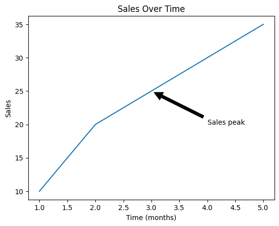
Figure 10: Plot with Arrow
6. Conclusion
Customizing plots in Matplotlib allows you to create clearer and more informative visualizations. By adding titles, labels, legends, gridlines, and annotations, you can enhance the readability and effectiveness of your plots. In the next article, we'll explore how to work with figures and subplots in Matplotlib to create more complex visualizations.