Creating Basic Plots with Matplotlib
Matplotlib is the foundation of data visualization in Python, and it offers a variety of plot types to help you understand your data. In this article, we'll explore how to create some of the most common and useful plots: line plots, bar plots, histograms, and scatter plots.
1. Line Plots
Line plots are one of the most common types of plots. They are useful for visualizing data points in a sequence, often over time.
1.1 Creating a Simple Line Plot
You can create a line plot using the plt.plot() function.
import matplotlib.pyplot as plt

# Sample data
x = [1, 2, 3, 4, 5]
y = [10, 20, 25, 30, 35]

# Creating a line plot
plt.plot(x, y)
plt.title('Simple Line Plot')
plt.xlabel('X-axis')
plt.ylabel('Y-axis')
plt.show()
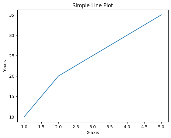
Figure 1: Basic Line Plot.
1.2 Customizing Line Plots
You can customize line plots by changing the color, line style, and adding markers.
# Customizing a line plot
plt.plot(x, y, color='red', linestyle='--', marker='o')
plt.title('Customized Line Plot')
plt.xlabel('X-axis')
plt.ylabel('Y-axis')
plt.show()
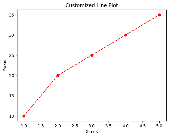
Figure 2: Customized Line Plot.
2. Bar Plots
Bar plots are ideal for comparing different categories. They can be vertical or horizontal.
2.1 Creating a Vertical Bar Plot
A vertical bar plot can be created using the plt.bar() function.
# Sample data
categories = ['A', 'B', 'C', 'D']
values = [5, 7, 8, 6]

# Creating a vertical bar plot
plt.bar(categories, values)
plt.title('Vertical Bar Plot')
plt.xlabel('Categories')
plt.ylabel('Values')
plt.show()
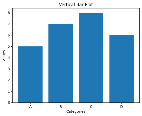
Figure 3: Vertical Bar Plot.
2.2 Creating a Horizontal Bar Plot
To create a horizontal bar plot, use the plt.barh() function.
# Creating a horizontal bar plot
plt.barh(categories, values, color='purple')
plt.title('Horizontal Bar Plot')
plt.xlabel('Values')
plt.ylabel('Categories')
plt.show()
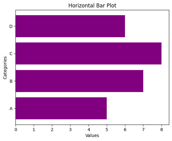
Figure 4: Horizontal Bar Plot.
3. Histograms
Histograms are used to represent the distribution of a dataset. They show how many data points fall within a certain range of values.
3.1 Creating a Simple Histogram
You can create a histogram using the plt.hist() function.
# Sample data
data = [1, 2, 2, 3, 3, 3, 4, 4, 5, 5, 5, 5]

# Creating a histogram
plt.hist(data, bins=5, color='green')
plt.title('Simple Histogram')
plt.xlabel('Value')
plt.ylabel('Frequency')
plt.show()
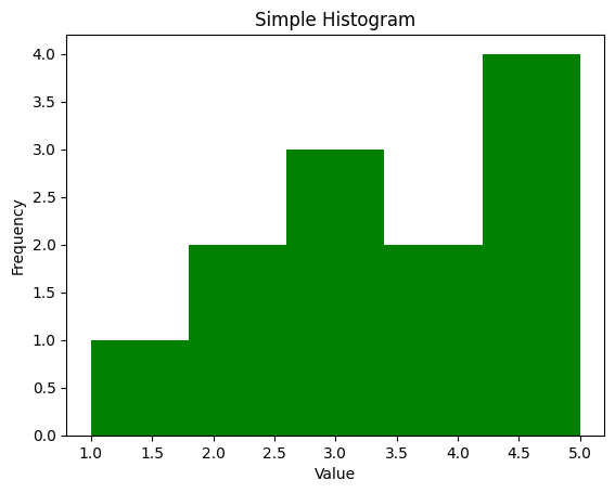
Figure 5: Simple Histogram
3.2 Customizing Histograms
You can adjust the number of bins and the color of the histogram for better visualization.
# Creating a customized histogram
plt.hist(data, bins=4, color='blue', edgecolor='black')
plt.title('Customized Histogram')
plt.xlabel('Value')
plt.ylabel('Frequency')
plt.show()
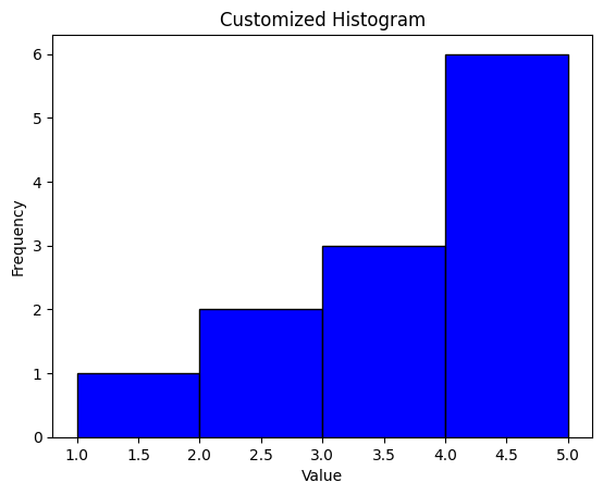
Figure 6: Custom Histogram
4. Scatter Plots
Scatter plots are useful for visualizing the relationship between two numerical variables.
4.1 Creating a Simple Scatter Plot
A scatter plot can be created using the plt.scatter() function.
# Sample data
x = [5, 7, 8, 7, 2, 17, 2, 9, 4, 11]
y = [99, 86, 87, 88, 100, 86, 103, 87, 94, 78]

# Creating a scatter plot
plt.scatter(x, y)
plt.title('Simple Scatter Plot')
plt.xlabel('X-axis')
plt.ylabel('Y-axis')
plt.show()
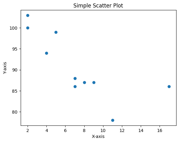
Figure 7: Simple Scatter Plot
4.2 Customizing Scatter Plots
You can customize scatter plots by changing the marker style, size, and color.
# Creating a customized scatter plot
plt.scatter(x, y, color='red', marker='x', s=100)
plt.title('Customized Scatter Plot')
plt.xlabel('X-axis')
plt.ylabel('Y-axis')
plt.show()
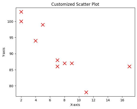
Figure 8: Customized Scatter Plot
5. Conclusion
Creating basic plots in Matplotlib is straightforward and allows you to visualize your data quickly. By mastering line plots, bar plots, histograms, and scatter plots, you'll be well-equipped to explore your data and communicate your findings effectively. In the next article, we'll delve into customizing plots in Matplotlib to make them more informative and visually appealing.